Building a Foundational Design System for Pagar.me
Overview
As the first dedicated UX Designer, I was tasked with leading the creation of a comprehensive design system for Pagar.me, a Brazilian fintech. The goal was to unify a fragmented product experience, establish a consistent visual identity, and scale design across a rapidly growing ecosystem of 10,000+ employees and external clients.
My Role
Lead UX DesignerKey Responsibilities: Design System Strategy, User Research, Usability & Accessibility Assessment, UI/Visual Design, Prototyping, Workshops, and Developer Collaboration.Tools: Sketch, Adobe CC, InVision, Zeplin, GitHub, Miro, Hotjar.
The problem
Scaling without a foundation.
Pagar.me experienced rapid, organic growth driven by its strong engineering culture. However, the lack of a dedicated design function led to:
- A "Frankenstein" product built from disparate templates.
- Critical usability and accessibility issues.
- Severe visual and functional inconsistencies across the platform.
- An inefficient workflow for designers and developers as the company and its parent group, Stone.co, scaled.
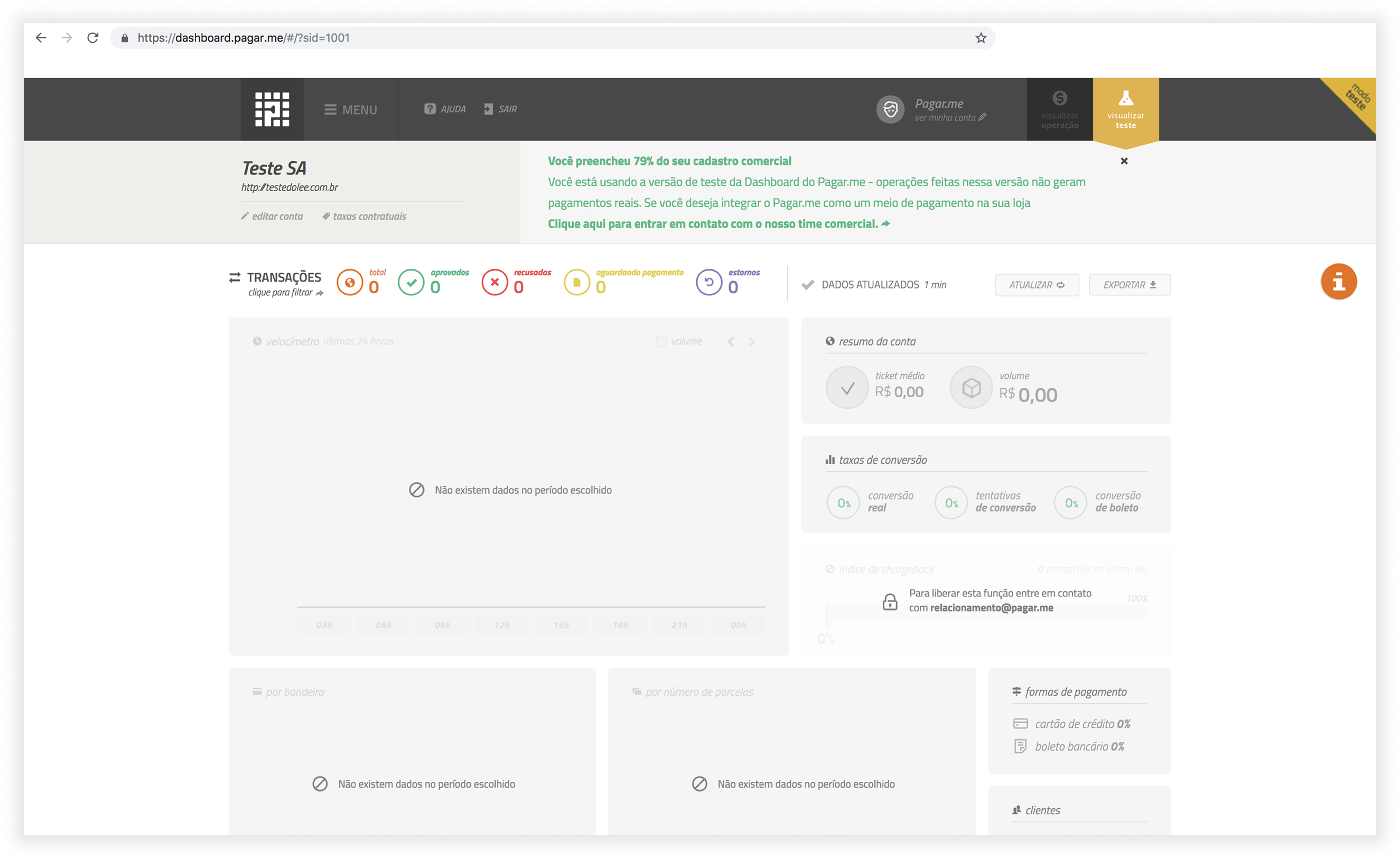
A screenshot of the old version of the product.
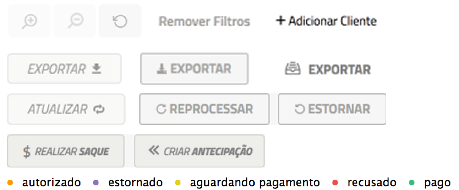
Button variation (yes, these were all buttons!)
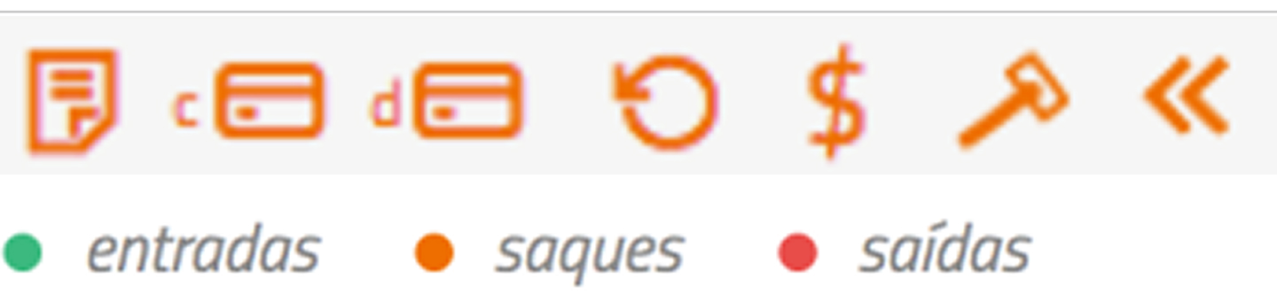
Read-only elements (no, you can't click on those.)
The solution
Pilot, a white-label design system.
I led the end-to-end creation of Pilot, a flexible, open-source design system focused on digital payment products. It provided:
- A unified foundation: A complete library of reusable components, patterns, and a new visual identity (typography, color, grid).
- Scalability & flexibility: A white-label solution for internal teams, sister companies, and the external Brazilian tech community to build their own dashboards.
- A collaborative workflow: We integrated design fully into the developer workflow using GitHub for documentation, version control, and asynchronous feedback, fostering full transparency.
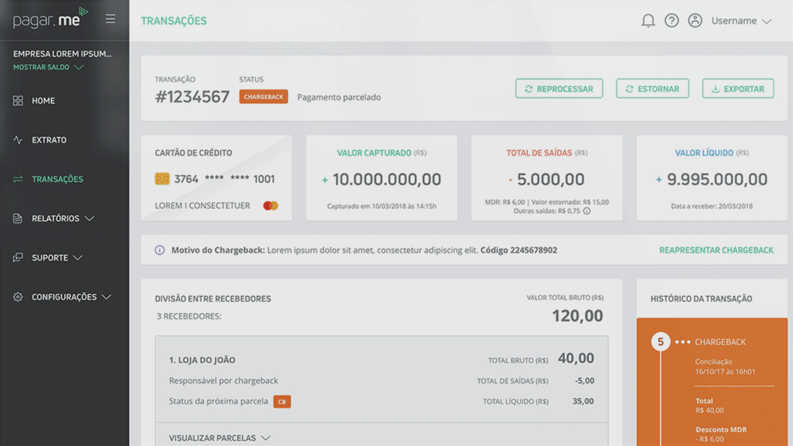
A first glance at the revamped version of the product, already using my Design System.
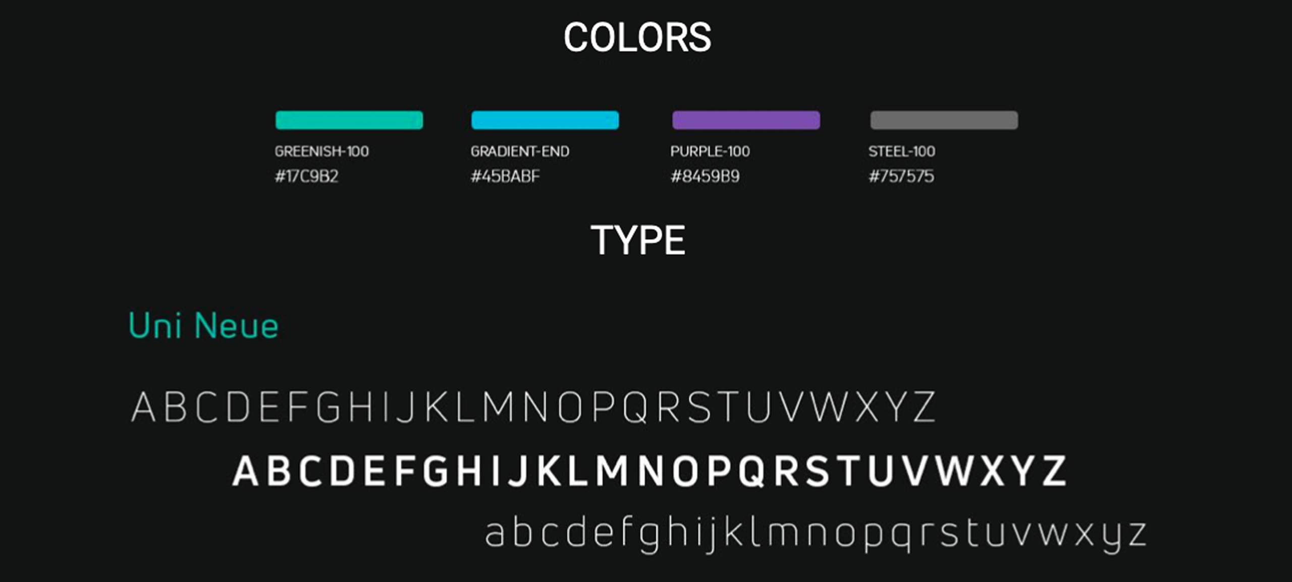
Some of the core elements Design System elements, as font family and colors.
Discover
I follow the Double Diamond framework, and will show next the steps I took in each phase:
I immersed myself in the context through:
- User interviews and co-creation sessions with clients.
- Diary studies to understand real-world usage.
- Audits of existing design debt and inconsistencies.
- Close collaboration with developers to understand technical constraints and ambitions.
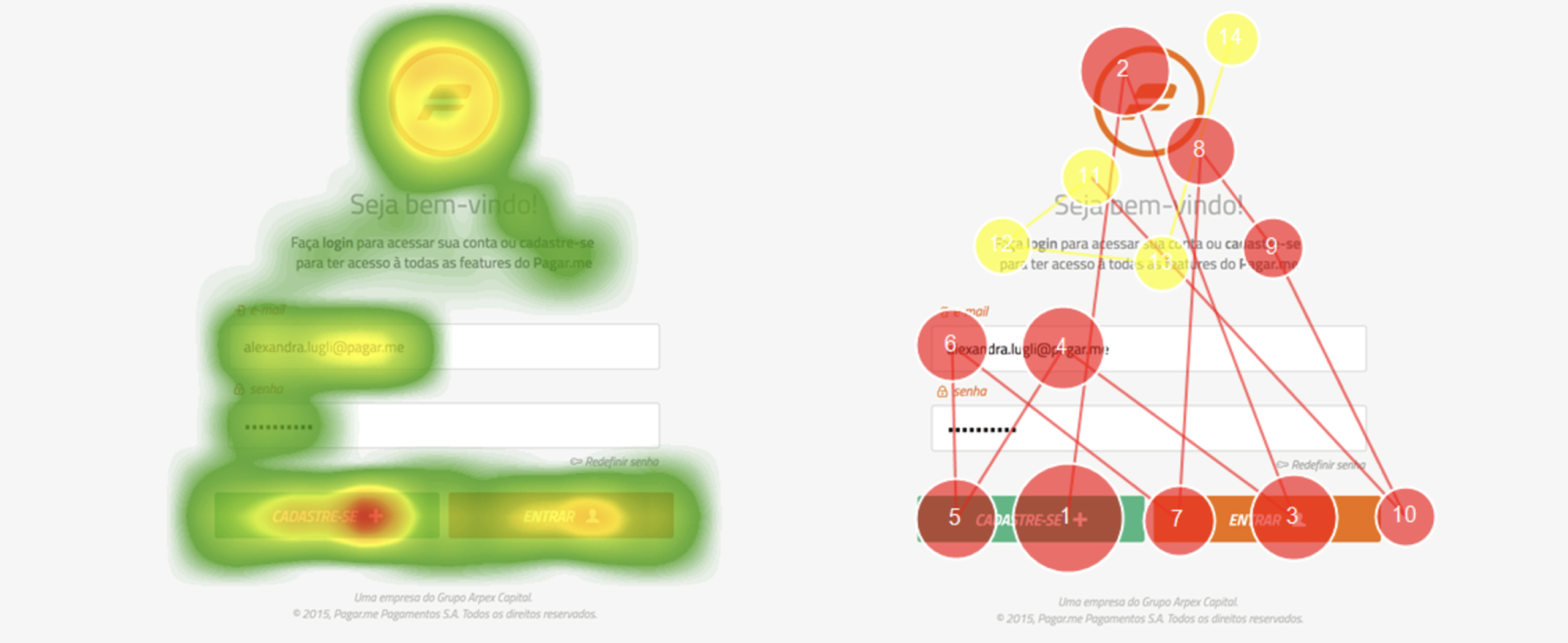
A heatmap of the old product login screen, generated during the initial studies.
Define
Our discovery revealed a need for a system that served two audiences simultaneously: our internal product teams and an external community of developers.We defined Pilot not just as a component library, but as a foundational "house" that others could "decorate" for their unique needs.
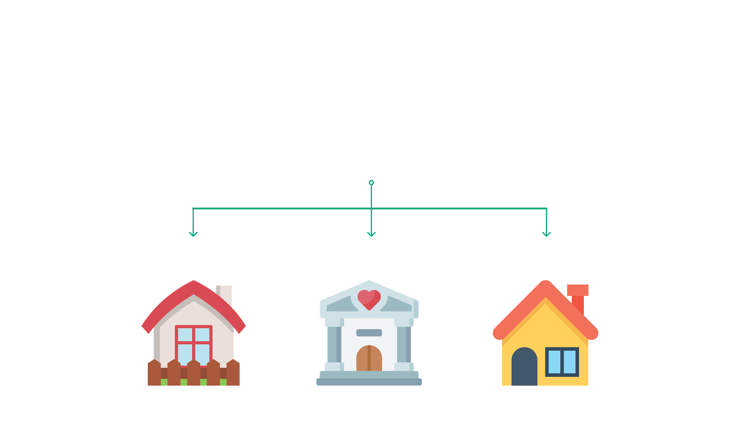
The former kit was the foundation that other companies could use to tailor to their brand and apply to their products.
Design
- I designed and documented the entire system in Sketch, supported by Adobe CC, InVision, and Zeplin.
- I revamped the core Pagar.me dashboard using the new system, improving information hierarchy, navigation, and introducing a responsive, mobile-friendly layout.
- I established a scalable process using GitHub to manage design issues, track progress, and collect feedback, making our work transparent and accessible to everyone.
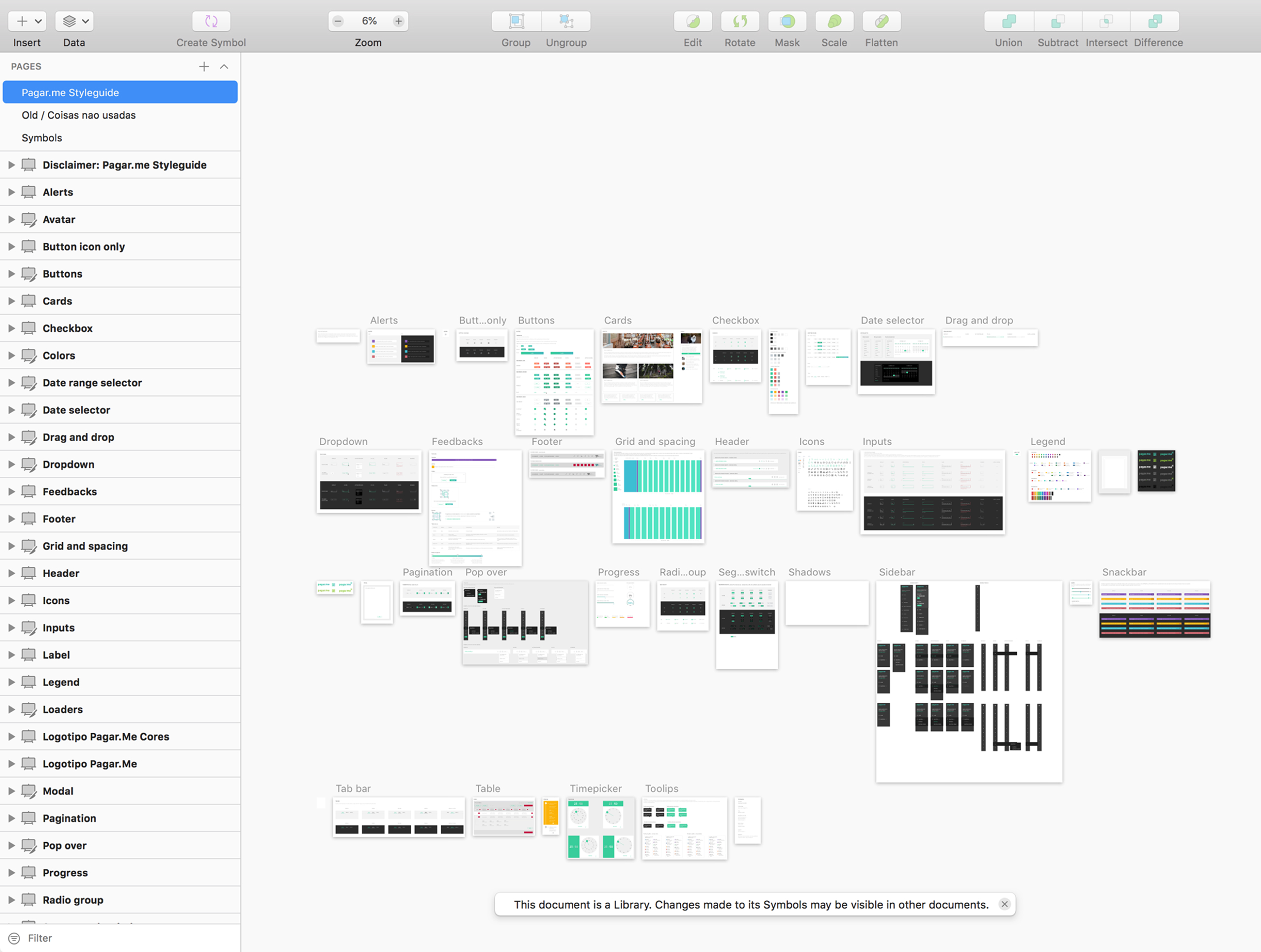
A screenshot of the main design system library, showing many components.
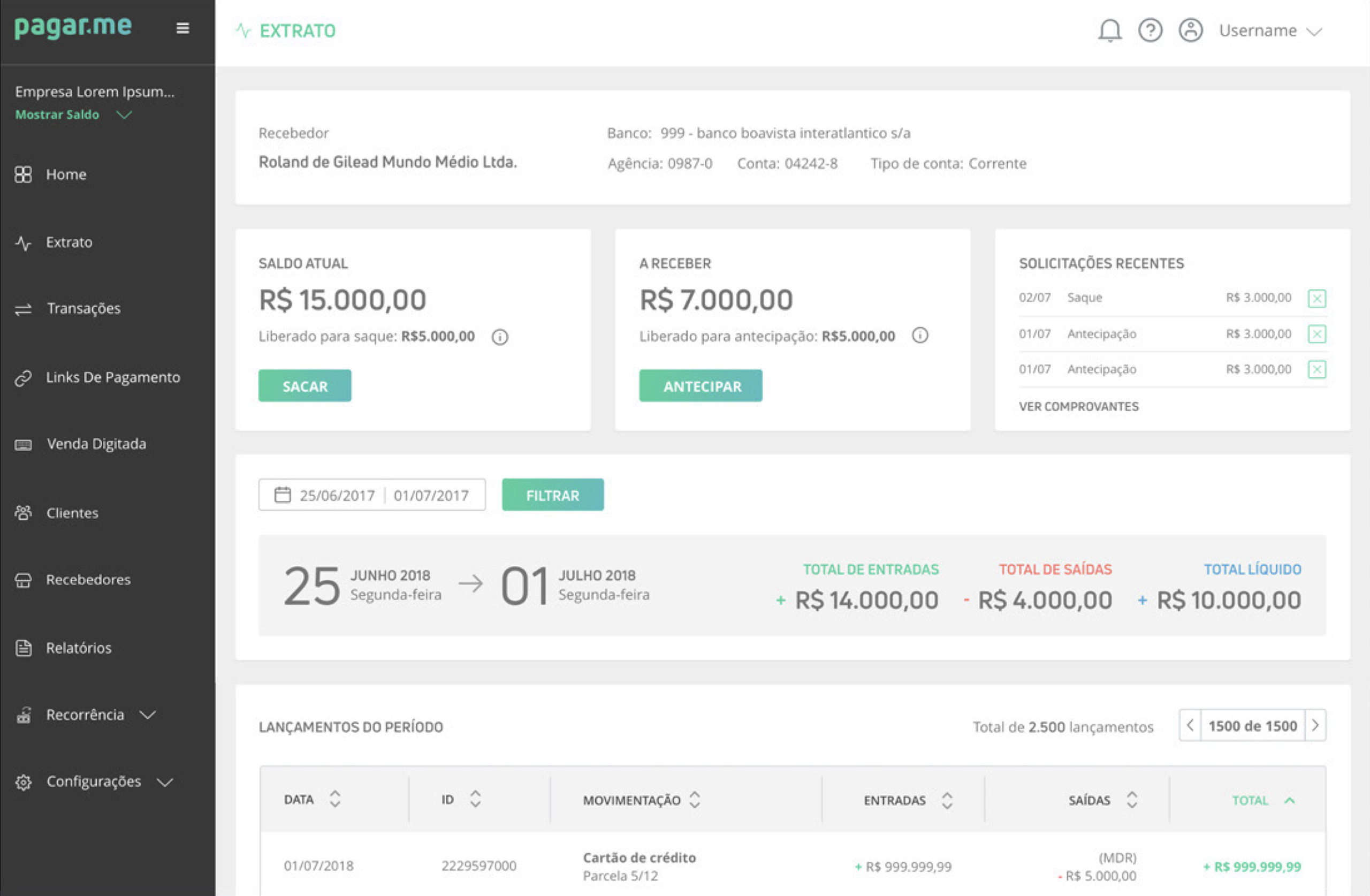
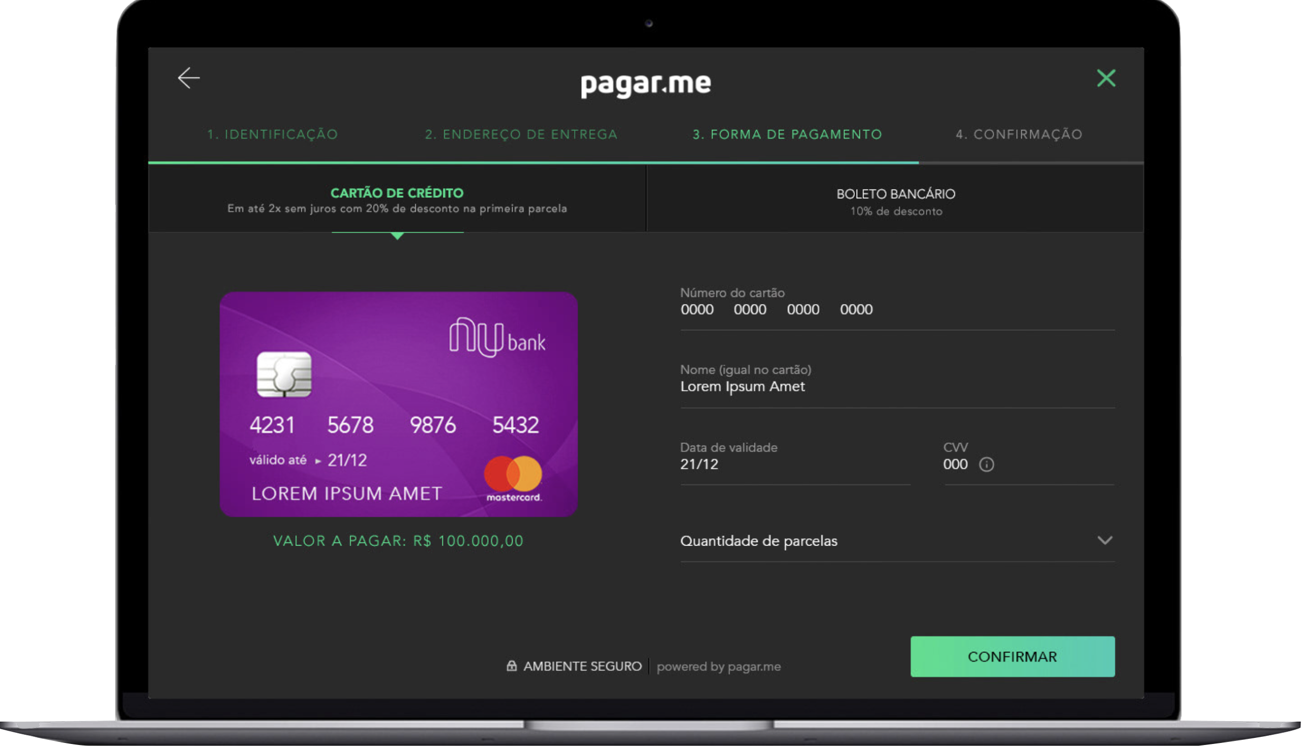
The Design System in practice again, in one of the internal pages of Pagar.me’s dashboard product.
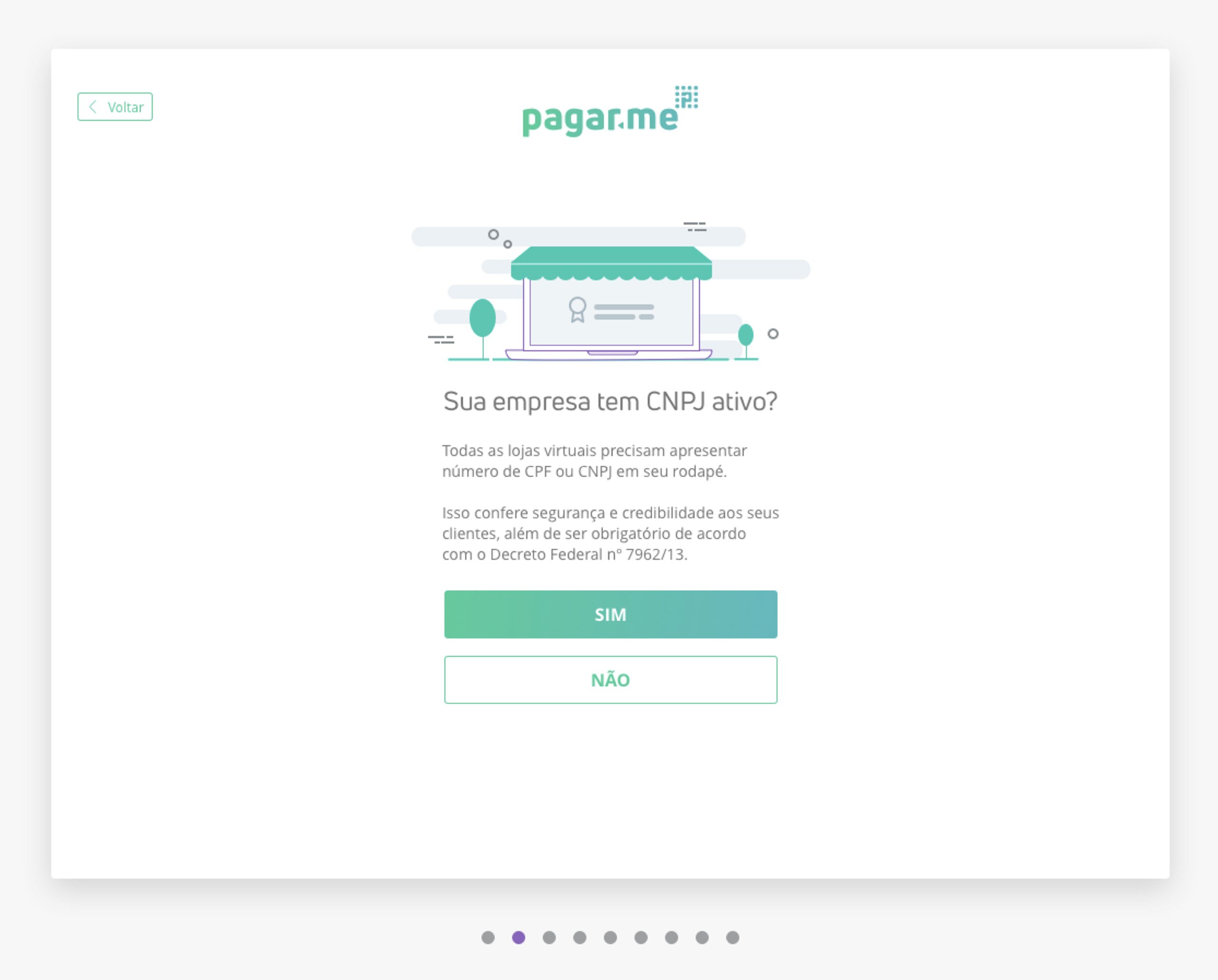
The Design System elements and the new art style being used in Pagar.me onboarding pages.
Deliver: Outcomes & Impact
- Efficiency: Dramatically accelerated feature development and time-to-market for all teams using the system.
- Consistency & quality: Established a consistent, accessible, and usable experience across all products, eliminating previous inconsistencies.
- Thought leadership: The open-source project positioned Pagar.me as a design and tech leader in the Brazilian market, getting plenty of awards.
- Scaled collaboration: Successfully supported a user base that grew from 1,000 to over 10,000 employees across the Stone.co group and their external clients.

Company awards over time, many of them won due to the design team work.
Conclusion
The Pilot Design System transformed Pagar.me's product ecosystem from a disjointed set of features into a cohesive, scalable platform.By championing user-centered design and a transparent, collaborative process, we built a foundation that empowered teams, improved the customer experience, and solidified the company's market position.
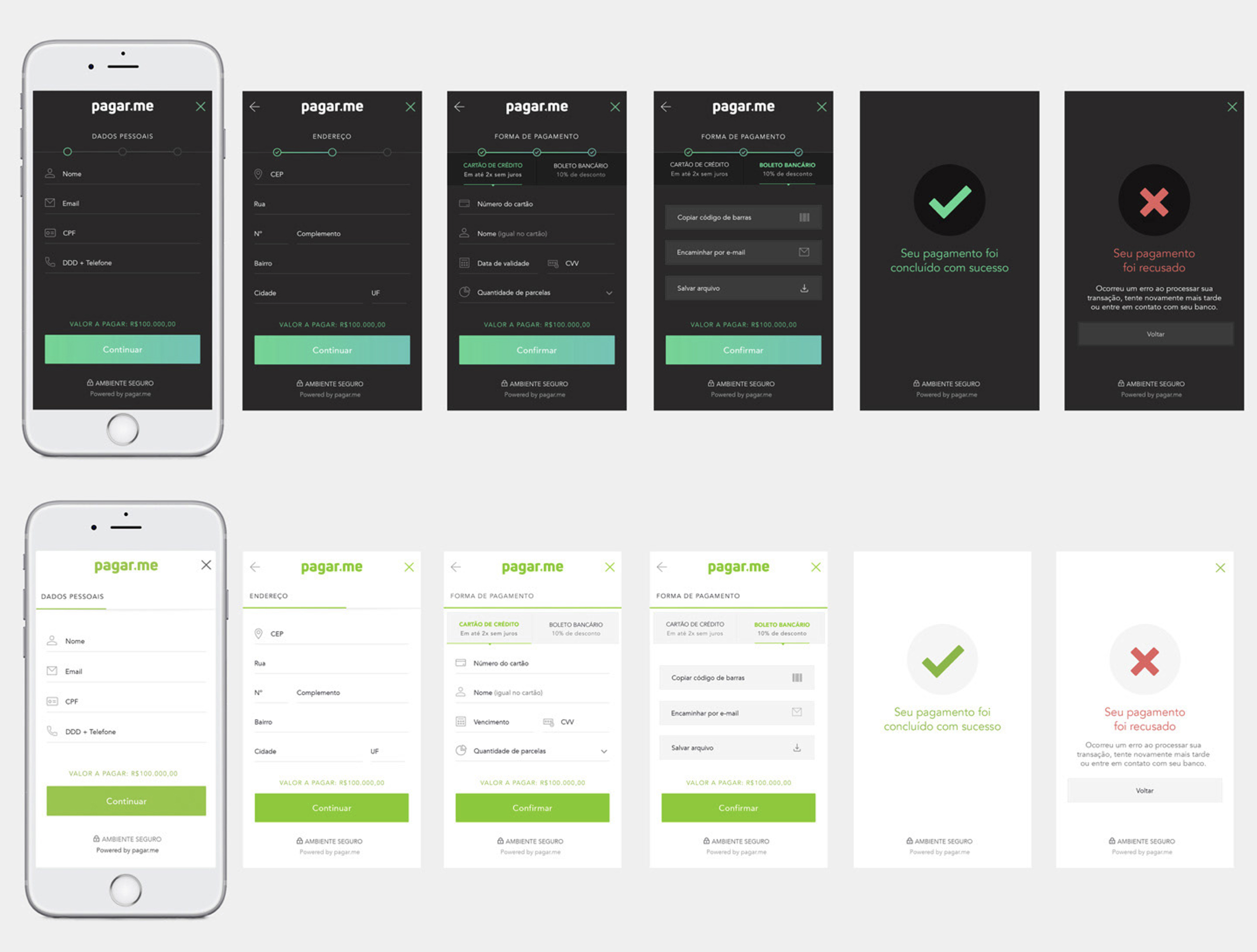
Thanks for reading.

Building a Foundational Design System for Pagar.me
Overview
As the first dedicated UX Designer, I was tasked with leading the creation of a comprehensive design system for Pagar.me, a Brazilian fintech. The goal was to unify a fragmented product experience, establish a consistent visual identity, and scale design across a rapidly growing ecosystem of 10,000+ employees and external clients.
My Role
Lead UX DesignerKey Responsibilities: Design System Strategy, User Research, Usability & Accessibility Assessment, UI/Visual Design, Prototyping, Workshops, and Developer Collaboration.Tools: Sketch, Adobe CC, InVision, Zeplin, GitHub, Miro, Hotjar.
The problem
Scaling without a foundation.
Pagar.me experienced rapid, organic growth driven by its strong engineering culture. However, the lack of a dedicated design function led to:
- A "Frankenstein" product built from disparate templates.
- Critical usability and accessibility issues.
- Severe visual and functional inconsistencies across the platform.
- An inefficient workflow for designers and developers as the company and its parent group, Stone.co, scaled.
A screenshot of the old version of the product.
Button variation (yes, these were all buttons!)
Read-only elements (no, you can't click on those.)
The solution
Pilot, a white-label design system.
I led the end-to-end creation of Pilot, a flexible, open-source design system focused on digital payment products. It provided:
- A unified foundation: A complete library of reusable components, patterns, and a new visual identity (typography, color, grid).
- Scalability & flexibility: A white-label solution for internal teams, sister companies, and the external Brazilian tech community to build their own dashboards.
- A collaborative workflow: We integrated design fully into the developer workflow using GitHub for documentation, version control, and asynchronous feedback, fostering full transparency.
A first glance at the revamped version of the product, already using my Design System.
Some of the core elements Design System elements, as font family and colors.
Discover
I follow the Double Diamond framework, and will show next the steps I took in each phase:
I immersed myself in the context through:
- User interviews and co-creation sessions with clients.
- Diary studies to understand real-world usage.
- Audits of existing design debt and inconsistencies.
- Close collaboration with developers to understand technical constraints and ambitions.
A heatmap of the old product login screen, generated during the initial studies.
Define
Our discovery revealed a need for a system that served two audiences simultaneously: our internal product teams and an external community of developers.We defined Pilot not just as a component library, but as a foundational "house" that others could "decorate" for their unique needs.
The former kit was the foundation that other companies could use to tailor to their brand and apply to their products.
Design
- I designed and documented the entire system in Sketch, supported by Adobe CC, InVision, and Zeplin.
- I revamped the core Pagar.me dashboard using the new system, improving information hierarchy, navigation, and introducing a responsive, mobile-friendly layout.
- I established a scalable process using GitHub to manage design issues, track progress, and collect feedback, making our work transparent and accessible to everyone.
A screenshot of the main design system library, showing many components.
The Design System in practice again, in one of the internal pages of Pagar.me’s dashboard product.
The Design System elements and the new art style being used in Pagar.me onboarding pages.
Deliver: Outcomes & Impact
- Efficiency: Dramatically accelerated feature development and time-to-market for all teams using the system.
- Consistency & quality: Established a consistent, accessible, and usable experience across all products, eliminating previous inconsistencies.
- Thought leadership: The open-source project positioned Pagar.me as a design and tech leader in the Brazilian market, getting plenty of awards.
- Scaled collaboration: Successfully supported a user base that grew from 1,000 to over 10,000 employees across the Stone.co group and their external clients.
Company awards over time, many of them won due to the design team work.
Conclusion
The Pilot Design System transformed Pagar.me's product ecosystem from a disjointed set of features into a cohesive, scalable platform.By championing user-centered design and a transparent, collaborative process, we built a foundation that empowered teams, improved the customer experience, and solidified the company's market position.
Thanks for reading.
Building a Foundational Design System for Pagar.me
Overview
As the first dedicated UX Designer, I was tasked with leading the creation of a comprehensive design system for Pagar.me, a Brazilian fintech. The goal was to unify a fragmented product experience, establish a consistent visual identity, and scale design across a rapidly growing ecosystem of 10,000+ employees and external clients.
My Role
Lead UX DesignerKey Responsibilities: Design System Strategy, User Research, Usability & Accessibility Assessment, UI/Visual Design, Prototyping, Workshops, and Developer Collaboration.Tools: Sketch, Adobe CC, InVision, Zeplin, GitHub, Miro, Hotjar.
The problem
Scaling without a foundation.
Pagar.me experienced rapid, organic growth driven by its strong engineering culture. However, the lack of a dedicated design function led to:
- A "Frankenstein" product built from disparate templates.
- Critical usability and accessibility issues.
- Severe visual and functional inconsistencies across the platform.
- An inefficient workflow for designers and developers as the company and its parent group, Stone.co, scaled.
A screenshot of the old version of the product.
Button variation (yes, these were all buttons!)
Read-only elements (no, you can't click on those.)
The solution
Pilot, a white-label design system.
I led the end-to-end creation of Pilot, a flexible, open-source design system focused on digital payment products. It provided:
- A unified foundation: A complete library of reusable components, patterns, and a new visual identity (typography, color, grid).
- Scalability & flexibility: A white-label solution for internal teams, sister companies, and the external Brazilian tech community to build their own dashboards.
- A collaborative workflow: We integrated design fully into the developer workflow using GitHub for documentation, version control, and asynchronous feedback, fostering full transparency.
A first glance at the revamped version of the product, already using my Design System.
Some of the core elements Design System elements, as font family and colors.
Discover
I follow the Double Diamond framework, and will show next the steps I took in each phase:
I immersed myself in the context through:
- User interviews and co-creation sessions with clients.
- Diary studies to understand real-world usage.
- Audits of existing design debt and inconsistencies.
- Close collaboration with developers to understand technical constraints and ambitions.
A heatmap of the old product login screen, generated during the initial studies.
Define
Our discovery revealed a need for a system that served two audiences simultaneously: our internal product teams and an external community of developers.We defined Pilot not just as a component library, but as a foundational "house" that others could "decorate" for their unique needs.
The former kit was the foundation that other companies could use to tailor to their brand and apply to their products.
Design
- I designed and documented the entire system in Sketch, supported by Adobe CC, InVision, and Zeplin.
- I revamped the core Pagar.me dashboard using the new system, improving information hierarchy, navigation, and introducing a responsive, mobile-friendly layout.
- I established a scalable process using GitHub to manage design issues, track progress, and collect feedback, making our work transparent and accessible to everyone.
A screenshot of the main design system library, showing many components.
The Design System in practice again, in one of the internal pages of Pagar.me’s dashboard product.
The Design System elements and the new art style being used in Pagar.me onboarding pages.
Deliver: Outcomes & Impact
- Efficiency: Dramatically accelerated feature development and time-to-market for all teams using the system.
- Consistency & quality: Established a consistent, accessible, and usable experience across all products, eliminating previous inconsistencies.
- Thought leadership: The open-source project positioned Pagar.me as a design and tech leader in the Brazilian market, getting plenty of awards.
- Scaled collaboration: Successfully supported a user base that grew from 1,000 to over 10,000 employees across the Stone.co group and their external clients.
Company awards over time, many of them won due to the design team work.
Conclusion
The Pilot Design System transformed Pagar.me's product ecosystem from a disjointed set of features into a cohesive, scalable platform.By championing user-centered design and a transparent, collaborative process, we built a foundation that empowered teams, improved the customer experience, and solidified the company's market position.
Thanks for reading.