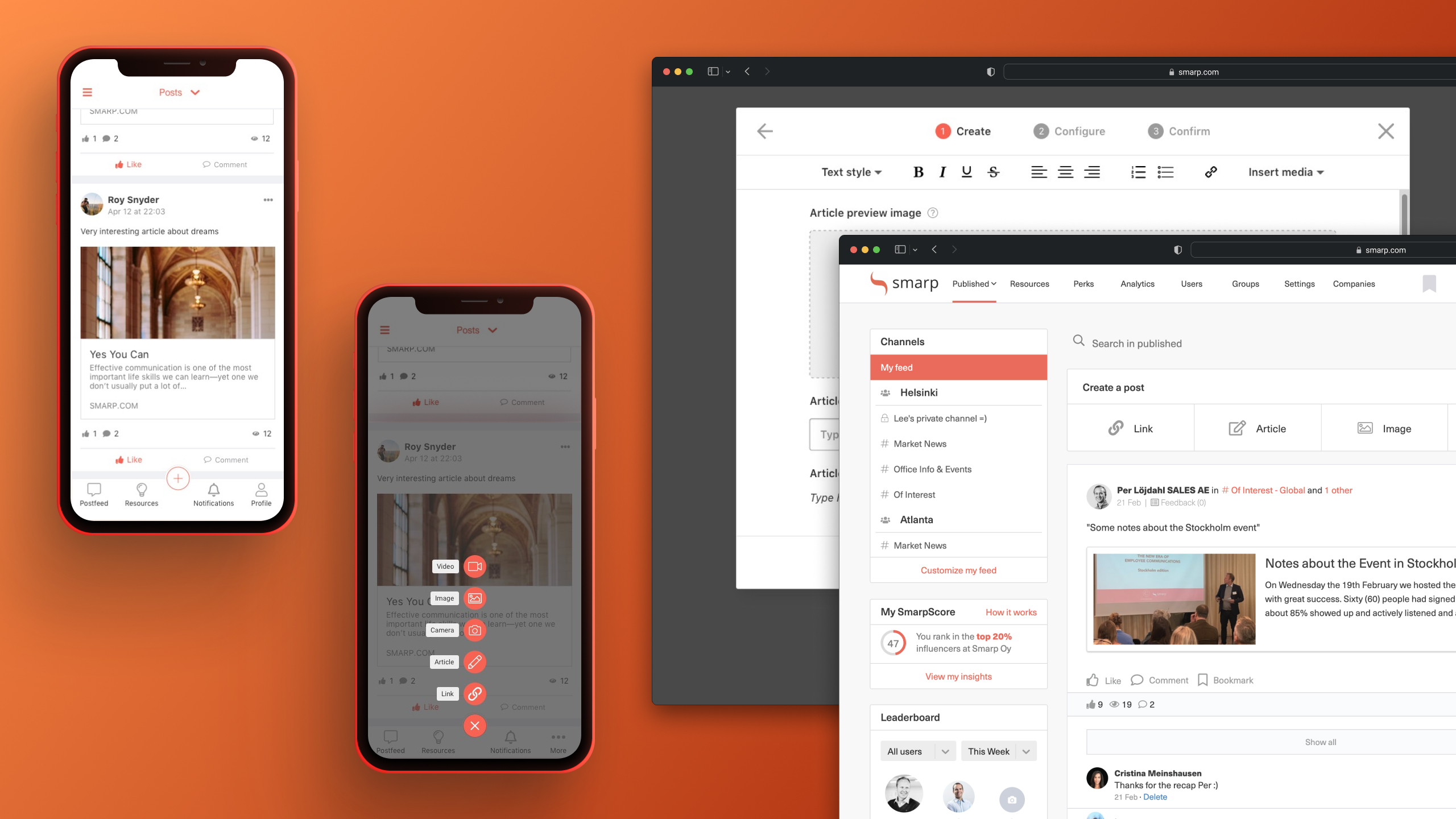
Redesigning Smarp's Content Creation Flow
Overview
Smarp, a global employee advocacy SaaS platform, needed to introduce new content types (images, video) without overwhelming its 4+ million users. The existing post-creation interface was cluttered, poorly organized, and led to user errors, resulting in a poor overall experience and reduced platform efficiency.This case study shows how I navigated the challenge from early concept to final delivery.
My Role
UX DesignerKey Responsibilities: Research, Strategy, UI, UX Design, Prototyping, Testing
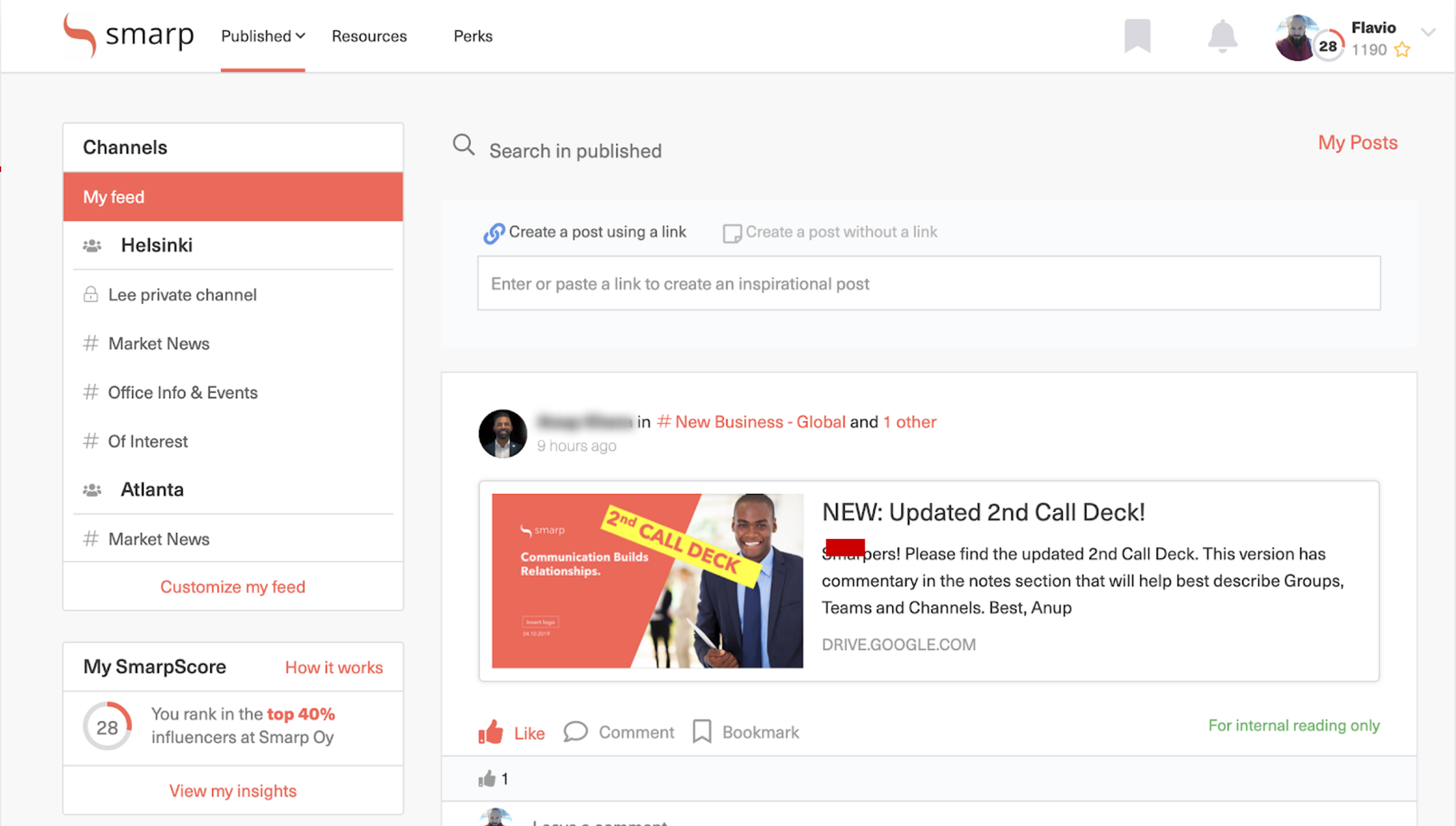
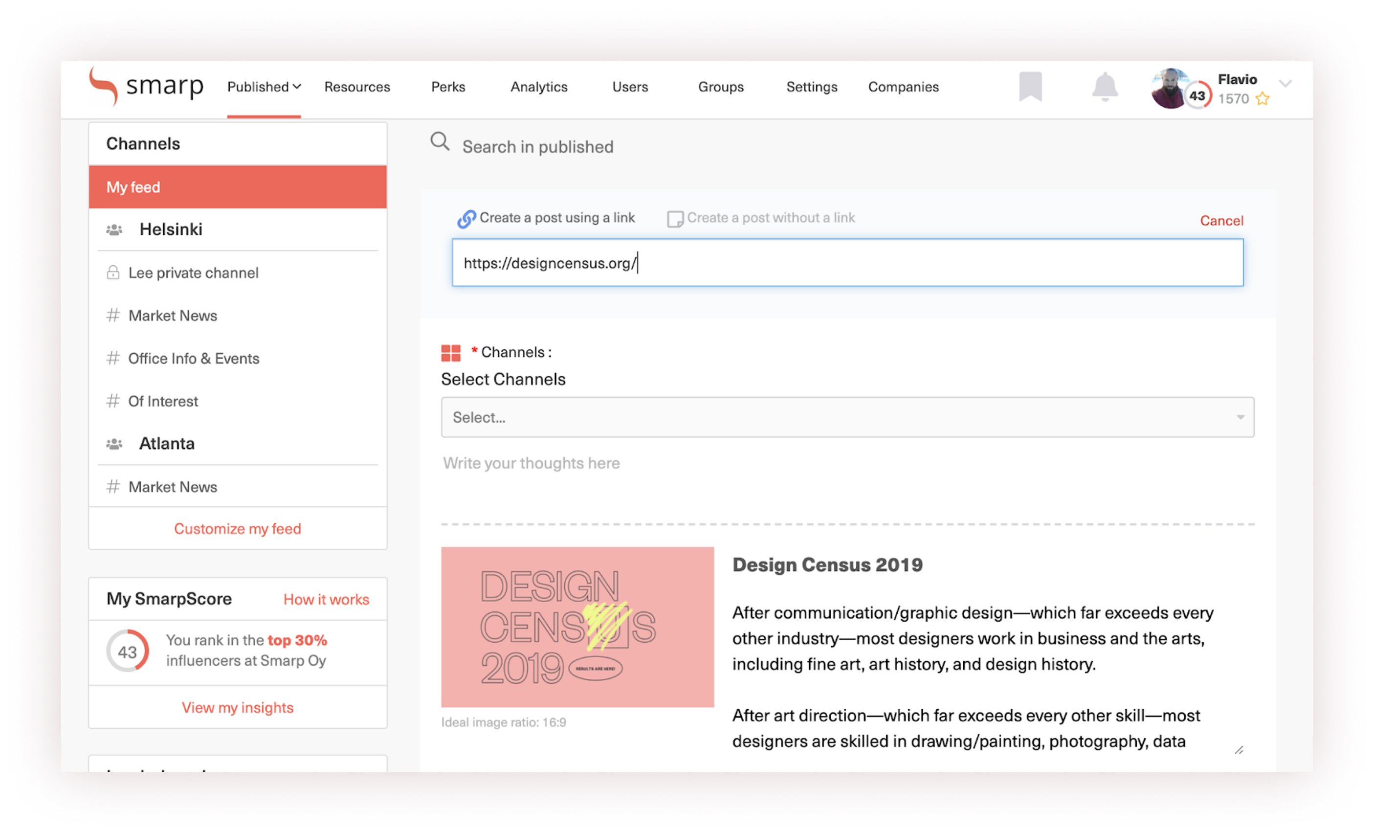
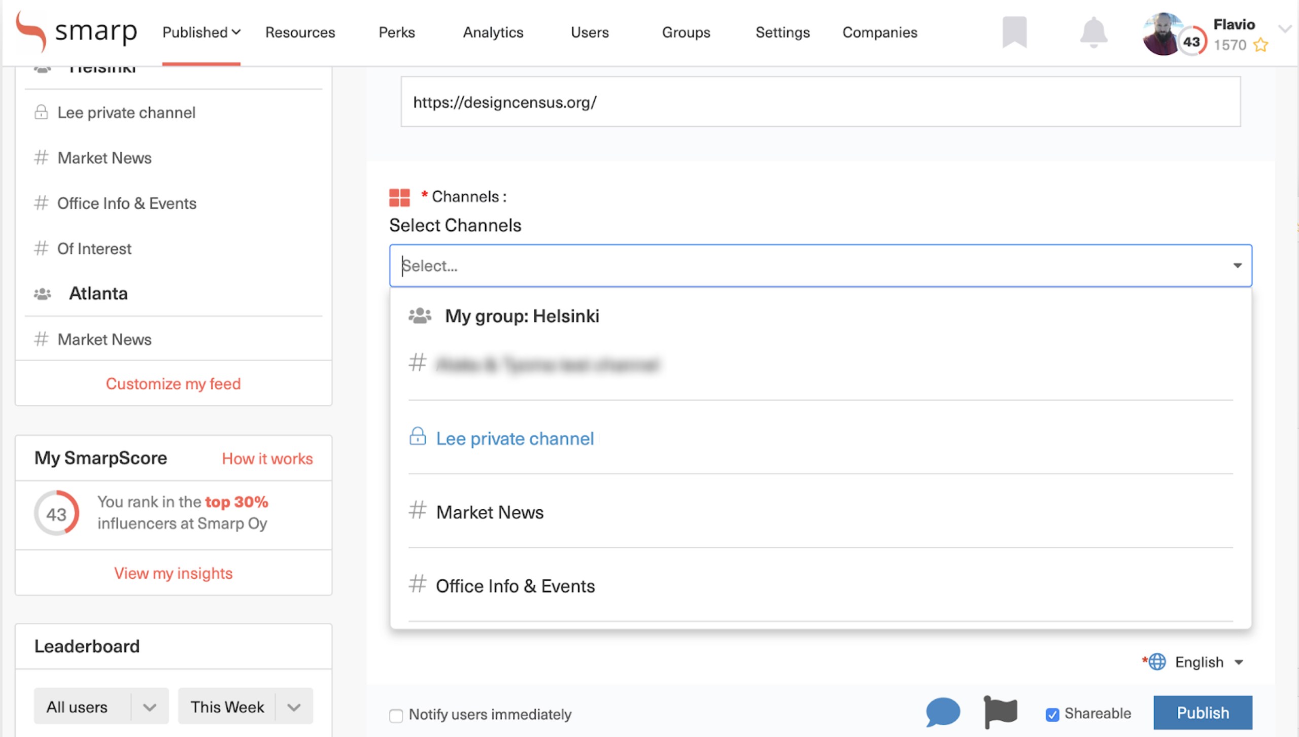
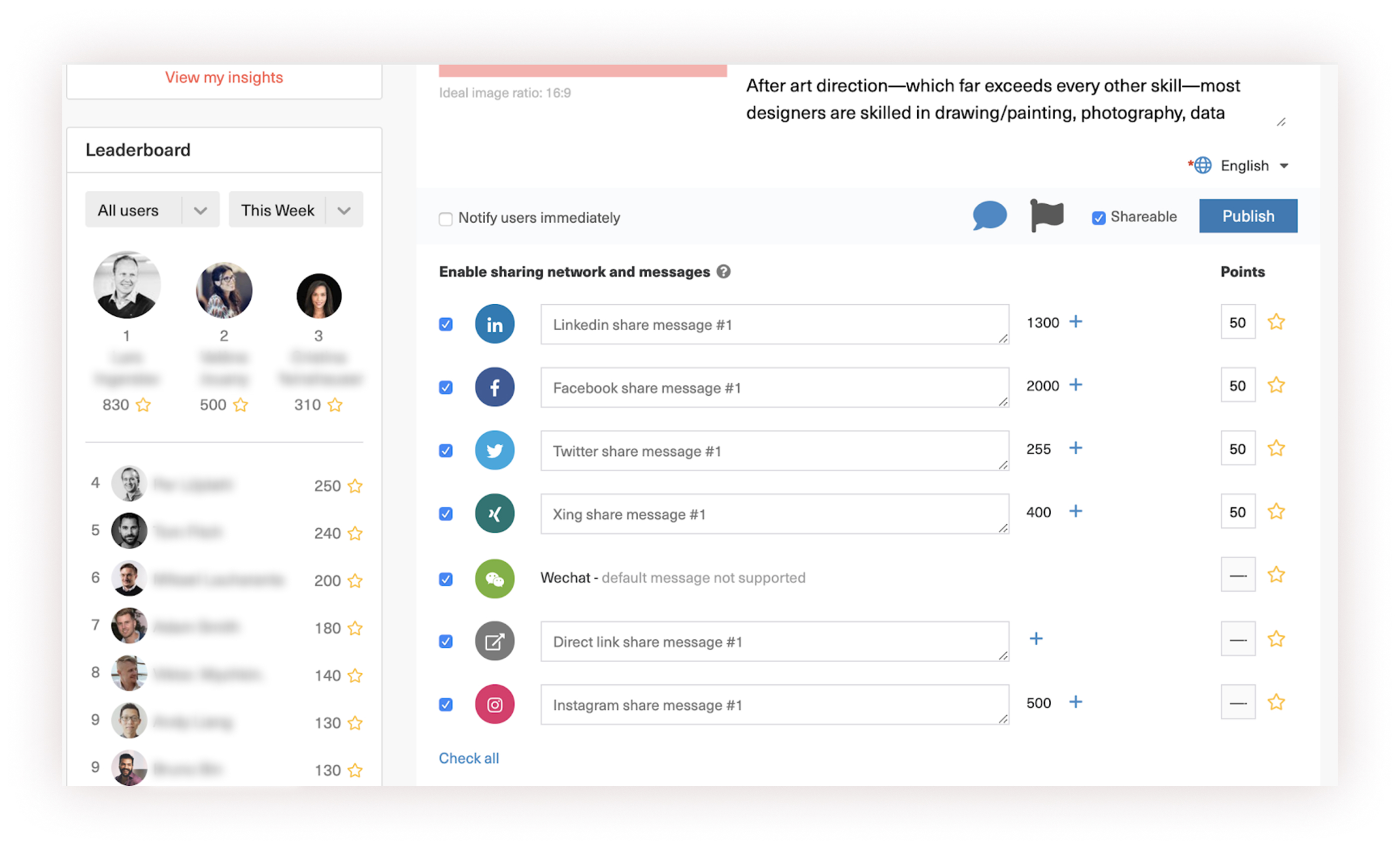
A bunch of screenshots of the old platform, showing all the existing problems I had to solve.
As the Lead UX Designer for the mobile applications, I owned the end-to-end experience, from heuristic analysis and user flow redesign to prototyping and testing, working in parallel with a colleague on the desktop version.
Key Performance Indicators (KPIs)
- A reduced number of “post creation errors” and admin review load.
- Increased number of “posts created per user”.
- A reduced “time on task” when creating posts.
Final Deliverables:
Heuristic evaluation, user flows, high-fidelity prototypes, usability test reports, and UI design handoff.
Discover: Framing the Problem
The project began with a significant constraint: a lack of user research and outdated documentation. I immediately initiated a structured discovery process to fill these gaps.
Heuristic evaluation
With limited resources for extensive user interviews, I conducted a heuristic evaluation of the existing web and mobile apps. This revealed critical issues: a confusing information architecture, misuse of platform-specific UI patterns, and cognitive overload from presenting all settings simultaneously.

A few examples of the heuristic evaluation I conducted.
Competitive analysis
I benchmarked against platforms like Facebook and Linkedin, noting especially the progressive disclosure approach to simplify sharing. However, I accounted for Smarp's unique need for more detailed post information to aid some of our user personas.
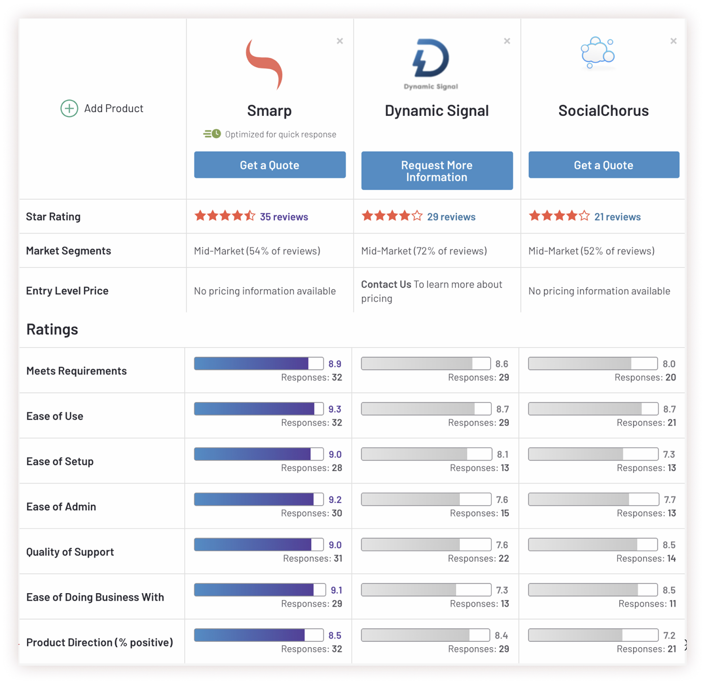
Some of the parameters and tools I used during the competitor analysis.
Problem hypothesis
Based on all of that, I concluced we overwhelm users with too much information during creation, resulting in error-prone posts, admin frustration, and reduced platform efficiency.
“How might we introduce new image and video content types without overwhelming users with options so we can increase creation efficiency and reduce errors?”
Define
A structured solution:The 3-step flow
The core of my design strategy was to deconstruct the monolithic creation process into a focused, linear flow. This reduced cognitive load by allowing users to concentrate on one task at a time.
Step 1 - Create: Focus on content only. Users choose a type (text, link, image, video) and provide the core text or piece of information to share.
Step 2 - Configure: Manage settings. Essential fields are presented first, with advanced options (campaigns, scheduling) available but secondary.
Step 3 - Confirm: Review and submit. A summary screen to allow users to double-check all content and settings before sending for admin approval, drastically reducing errors by giving them a chance fo fix them before posting.
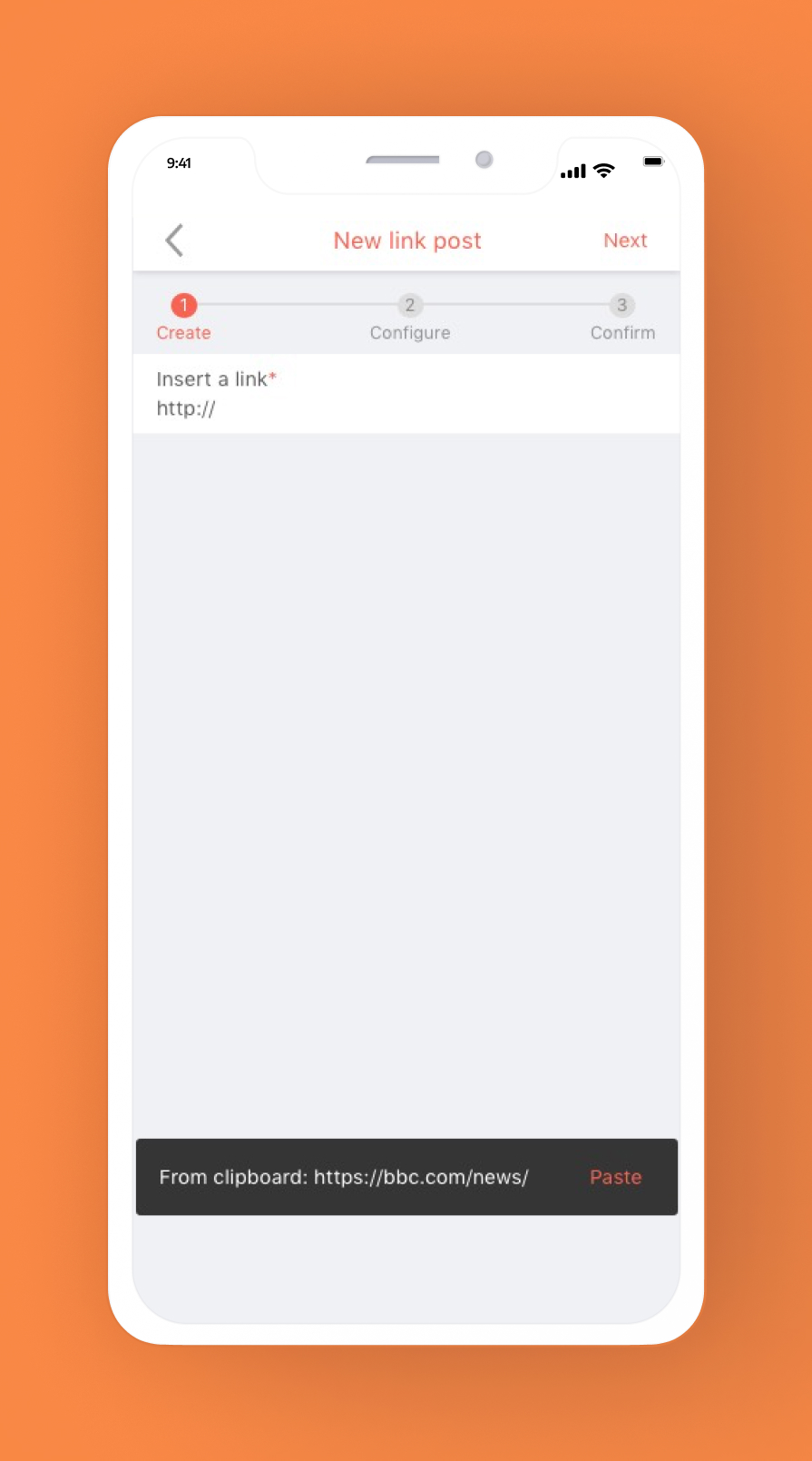
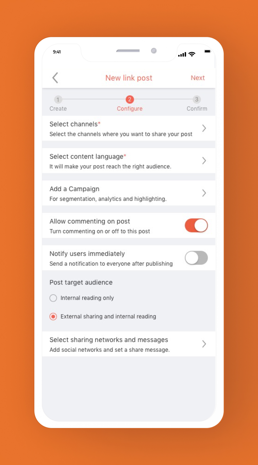
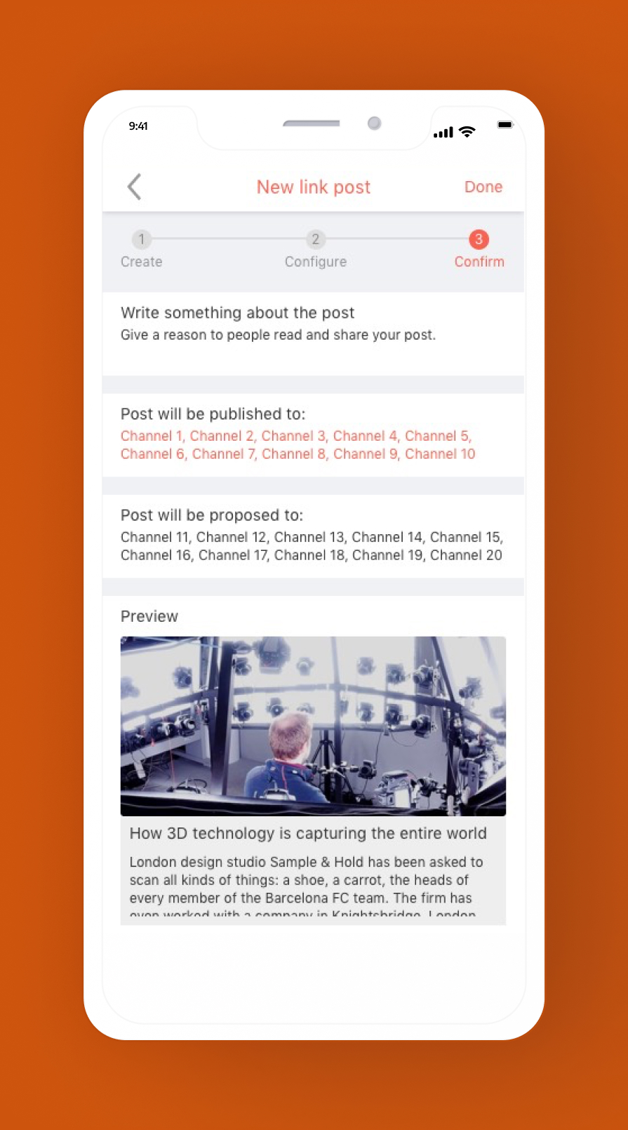
The 3 main steps redesigned by me: create, configure and confirm.
Design
The wrong approach
During this process, I learned the project had incorrectly started with a desktop-first approach, despite a significant portion of users being blue-collar workers without constant computer access.I then pushed for a mobile-first redesign, moving the creation button to a thumb-friendly location and optimizing the entire flow for smaller screens.
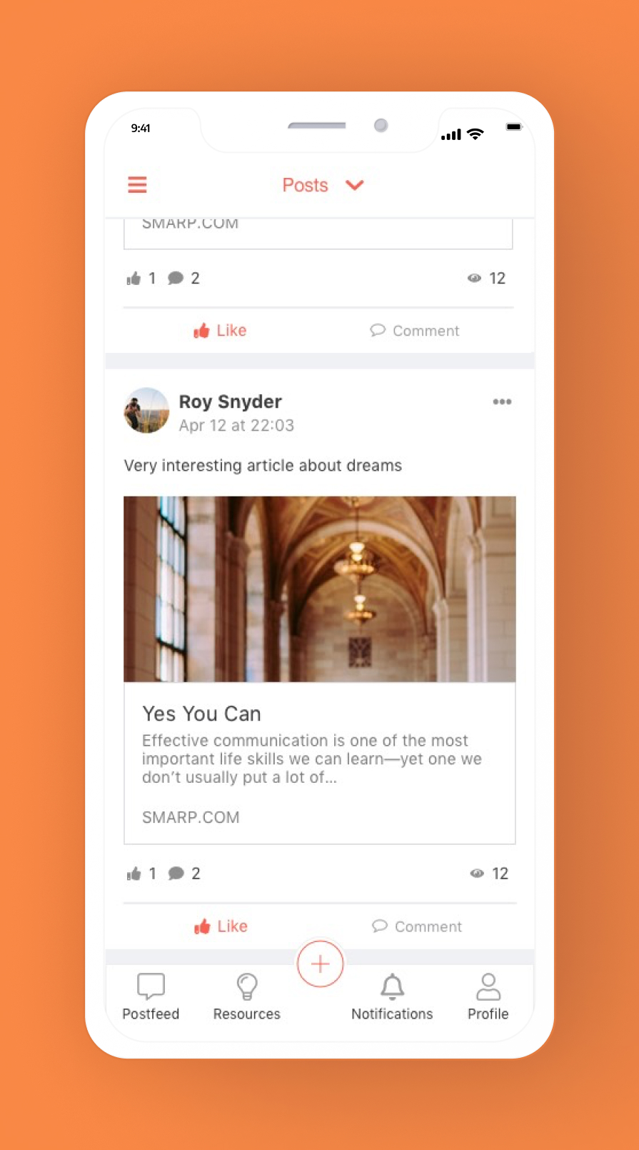
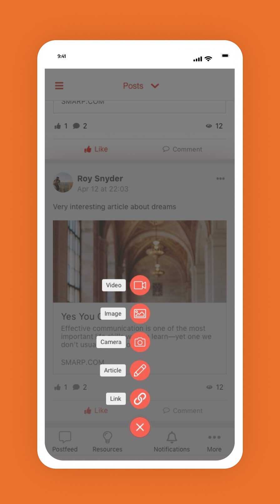
The new feed layout and content creation pattern that I introduced.
Desktop integration
On desktop, the flow was contained within a modal to maintain user focus, with settings reorganized under a clear visual hierarchy.
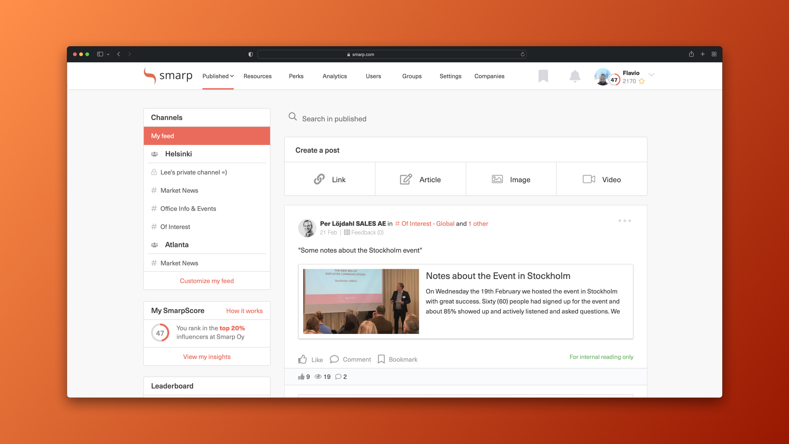
The desktop feed had a different approach for content creation, but still better than the old version.
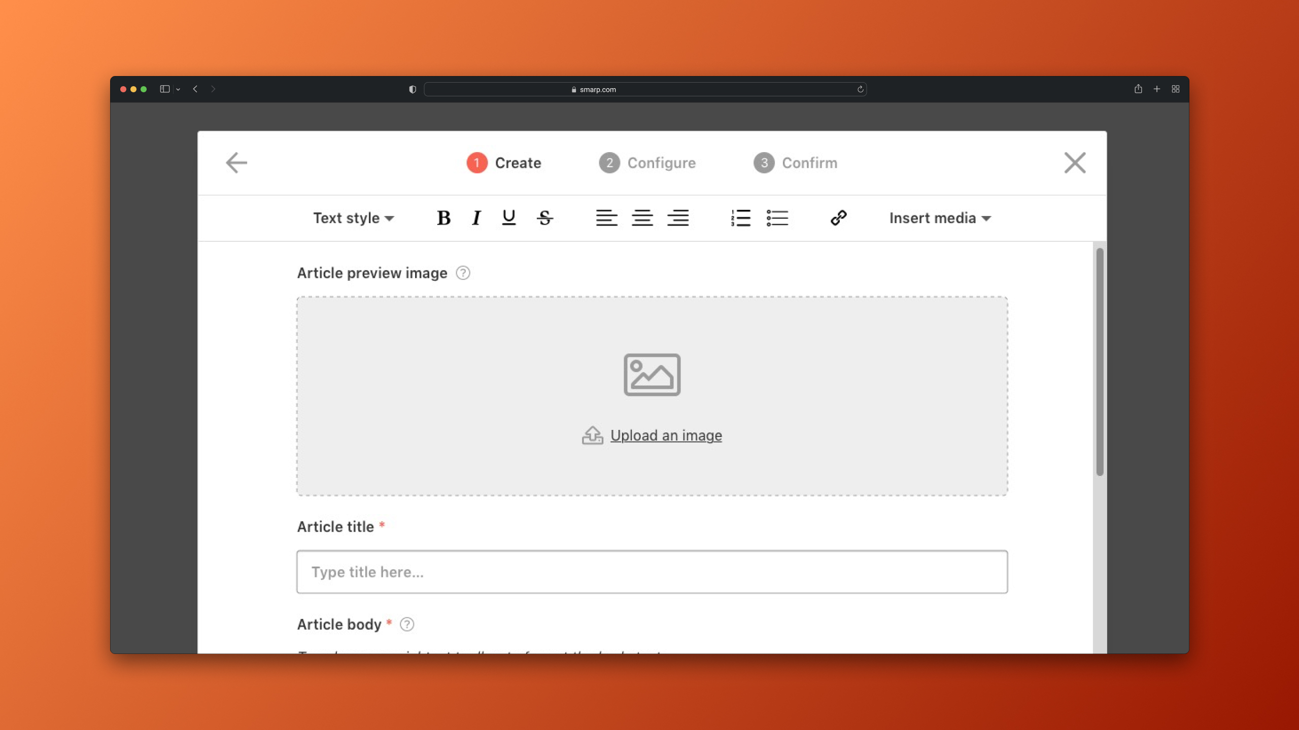
Three-step creation flow show in a modal on desktop.
Advocating for a better model
I also proposed a more radical concept that would minimize clicks and pre-populate settings based on user behavior. While stakeholder concerns about scope prevented its adoption, it demonstrated forward-thinking to solve core usability issues.
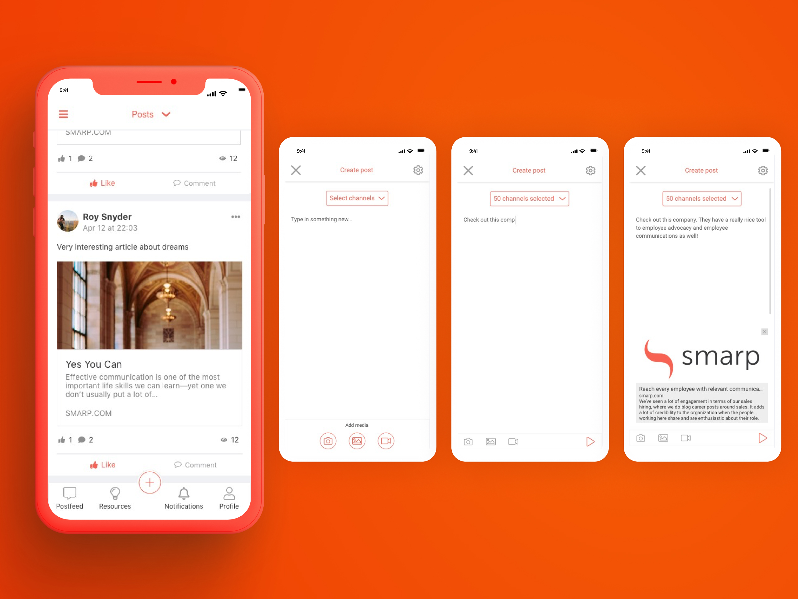
This new concept would be even more straightfoward, removing the need of users to pick what kind of content they wanted to create beforehand, as most other social media platforms work.
Validation & Impact
We validated the 3-steps flow with usability tests using high-fidelity prototypes. Here are some of the comments I’ve got during the tests:
"This is perfect!"
"Pretty similar to what we currently have (for training new employees)."
"Preview is quite useful... Pretty simple."
The tests confirmed the new flow matched users' mental models and significantly improved clarity. Post-launch, we monitored a 25% decrease for “Time on Task” on post creation, indicating a clear improvement on efficiency, alongside a reduction in post correction requests.
Retrospective & Learnings
Clear product strategy is key
Misalignment between desktop and mobile design efforts created avoidable friction. Early, strategic involvement could have established a mobile-first approach since start.
The right amount of documentation saves time
While not all documentation is a must, well-defined personas, user data and flows are crucial for speed and alignment. Their absence at the start of this project was significantly dragging us behind.
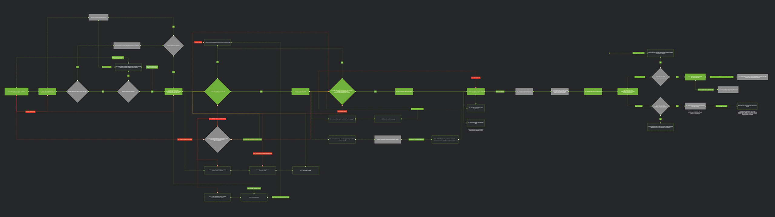
A high level view of one of the flows I documented during this project.
Business shifts change user context
A change in the company's business focus had altered the primary user context from desktop to mobile. Continuously evaluating how product strategy impacts user needs is essential for relevance and a suistanable growth.
Conclusion
This project successfully scaled Smarp's content capabilities while simplifying the user experience, demonstrating my ability to drive user-centered design from ambiguity to measurable results.
Thank you for reading.
More projects
Redesigning Smarp's Content Creation Flow
Overview
Smarp, a global employee advocacy SaaS platform, needed to introduce new content types (images, video) without overwhelming its 4+ million users. The existing post-creation interface was cluttered, poorly organized, and led to user errors, resulting in a poor overall experience and reduced platform efficiency.This case study shows how I navigated the challenge from early concept to final delivery.
My Role
UX DesignerKey Responsibilities: Research, Strategy, UI, UX Design, Prototyping, Testing
A bunch of screenshots of the old platform, showing all the existing problems I had to solve.
As the Lead UX Designer for the mobile applications, I owned the end-to-end experience, from heuristic analysis and user flow redesign to prototyping and testing, working in parallel with a colleague on the desktop version.
Key Performance Indicators (KPIs)
- A reduced number of “post creation errors” and admin review load.
- Increased number of “posts created per user”.
- A reduced “time on task” when creating posts.
Final Deliverables:
Heuristic evaluation, user flows, high-fidelity prototypes, usability test reports, and UI design handoff.
Discover: Framing the Problem
The project began with a significant constraint: a lack of user research and outdated documentation. I immediately initiated a structured discovery process to fill these gaps.
Heuristic evaluation
With limited resources for extensive user interviews, I conducted a heuristic evaluation of the existing web and mobile apps. This revealed critical issues: a confusing information architecture, misuse of platform-specific UI patterns, and cognitive overload from presenting all settings simultaneously.
A few examples of the heuristic evaluation I conducted.
Competitive analysis
I benchmarked against platforms like Facebook and Linkedin, noting especially the progressive disclosure approach to simplify sharing. However, I accounted for Smarp's unique need for more detailed post information to aid some of our user personas.
Some of the parameters and tools I used during the competitor analysis.
Problem hypothesis
Based on all of that, I concluced we overwhelm users with too much information during creation, resulting in error-prone posts, admin frustration, and reduced platform efficiency.
“How might we introduce new image and video content types without overwhelming users with options so we can increase creation efficiency and reduce errors?”
Define
A structured solution: The 3-step flow
The core of my design strategy was to deconstruct the monolithic creation process into a focused, linear flow. This reduced cognitive load by allowing users to concentrate on one task at a time.
Step 1 - Create: Focus on content only. Users choose a type (text, link, image, video) and provide the core text or piece of information to share.
Step 2 - Configure: Manage settings. Essential fields are presented first, with advanced options (campaigns, scheduling) available but secondary.
Step 3 - Confirm: Review and submit. A summary screen to allow users to double-check all content and settings before sending for admin approval, drastically reducing errors by giving them a chance fo fix them before posting.
The 3 main steps redesigned by me: create, configure and confirm.
Design
The wrong approach
During this process, I learned the project had incorrectly started with a desktop-first approach, despite a significant portion of users being blue-collar workers without constant computer access.I then pushed for a mobile-first redesign, moving the creation button to a thumb-friendly location and optimizing the entire flow for smaller screens.
The new feed layout and content creation pattern that I introduced.
Desktop integration
On desktop, the flow was contained within a modal to maintain user focus, with settings reorganized under a clear visual hierarchy.
The desktop feed had a different approach for content creation, but still better than the old version.
Three-step creation flow show in a modal on desktop.
Advocating for a better model
I also proposed a more radical concept that would minimize clicks and pre-populate settings based on user behavior. While stakeholder concerns about scope prevented its adoption, it demonstrated forward-thinking to solve core usability issues.
This new concept would be even more straightfoward, removing the need of users to pick what kind of content they wanted to create beforehand, as most other social media platforms work.
Validation & Impact
We validated the 3-steps flow with usability tests using high-fidelity prototypes. Here are some of the comments I’ve got during the tests:
"This is perfect!"
"Pretty similar to what we currently have (for training new employees)."
"Preview is quite useful... Pretty simple."
The tests confirmed the new flow matched users' mental models and significantly improved clarity. Post-launch, we monitored a 25% decrease for “Time on Task” on post creation, indicating a clear improvement on efficiency, alongside a reduction in post correction requests.
Retrospective & Learnings
Clear product strategy is key
Misalignment between desktop and mobile design efforts created avoidable friction. Early, strategic involvement could have established a mobile-first approach since start.
The right amount of documentation saves time
While not all documentation is a must, well-defined personas, user data and flows are crucial for speed and alignment. Their absence at the start of this project was significantly dragging us behind.
A high level view of one of the flows I documented during this project.
Business shifts change user context
A change in the company's business focus had altered the primary user context from desktop to mobile. Continuously evaluating how product strategy impacts user needs is essential for relevance and a suistanable growth.
Conclusion
This project successfully scaled Smarp's content capabilities while simplifying the user experience, demonstrating my ability to drive user-centered design from ambiguity to measurable results.
Thank you for reading.
More projects
Redesigning Smarp's Content Creation Flow
Overview
Smarp, a global employee advocacy SaaS platform, needed to introduce new content types (images, video) without overwhelming its 4+ million users. The existing post-creation interface was cluttered, poorly organized, and led to user errors, resulting in a poor overall experience and reduced platform efficiency.This case study shows how I navigated the challenge from early concept to final delivery.
My Role
UX DesignerKey Responsibilities: Research, Strategy, UI, UX Design, Prototyping, Testing
A bunch of screenshots of the old platform, showing all the existing problems I had to solve.
As the Lead UX Designer for the mobile applications, I owned the end-to-end experience, from heuristic analysis and user flow redesign to prototyping and testing, working in parallel with a colleague on the desktop version.
Key Performance Indicators (KPIs)
- A reduced number of “post creation errors” and admin review load.
- Increased number of “posts created per user”.
- A reduced “time on task” when creating posts.
Final Deliverables:
Heuristic evaluation, user flows, high-fidelity prototypes, usability test reports, and UI design handoff.
Discover: Framing the Problem
The project began with a significant constraint: a lack of user research and outdated documentation. I immediately initiated a structured discovery process to fill these gaps.
Heuristic evaluation
With limited resources for extensive user interviews, I conducted a heuristic evaluation of the existing web and mobile apps. This revealed critical issues: a confusing information architecture, misuse of platform-specific UI patterns, and cognitive overload from presenting all settings simultaneously.
A few examples of the heuristic evaluation I conducted.
Competitive analysis
I benchmarked against platforms like Facebook and Linkedin, noting especially the progressive disclosure approach to simplify sharing. However, I accounted for Smarp's unique need for more detailed post information to aid some of our user personas.
Some of the parameters and tools I used during the competitor analysis.
Problem hypothesis
Based on all of that, I concluded we overwhelmed users with too much information during creation, resulting in error-prone posts, admin frustration, and reduced platform efficiency.
I then refined into the following problem statement:
“How might we introduce new image and video content types without overwhelming users with options so we can increase creation efficiency and reduce errors?”
Define
A structured solution: The 3-step flow
The core of my design strategy was to deconstruct the monolithic creation process into a focused, linear flow. This reduced cognitive load by allowing users to concentrate on one task at a time.
Step 1 - Create: Focus on content only. Users choose a type (text, link, image, video) and provide the core text or piece of information to share.
Step 2 - Configure: Manage settings. Essential fields are presented first, with advanced options (campaigns, scheduling) available but secondary.
Step 3 - Confirm: Review and submit. A summary screen to allow users to double-check all content and settings before sending for admin approval, drastically reducing errors by giving them a chance fo fix them before posting.
The 3 main steps redesigned by me: create, configure and confirm.
Design
The wrong approach
During this process, I learned the project had incorrectly started with a desktop-first approach, despite a significant portion of users being blue-collar workers without constant computer access.I then pushed for a mobile-first redesign, moving the creation button to a thumb-friendly location and optimizing the entire flow for smaller screens.
The new feed layout and content creation pattern that I introduced.
Desktop integration
On desktop, the flow was contained within a modal to maintain user focus, with settings reorganized under a clear visual hierarchy.
The desktop feed had a different approach for content creation, but still better than the old version.
Three-step creation flow show in a modal on desktop.
Advocating for a better model
I also proposed a more radical concept that would minimize clicks and pre-populate settings based on user behavior. While stakeholder concerns about scope prevented its adoption, it demonstrated forward-thinking to solve core usability issues.
This new concept would be even more straightforward, by using recognizable patterns. It would remove the need of users to pick what kind of content they wanted to create beforehand, as most other social media platforms work, reducing plenty of clicks and cognitive load during the process.
Validation & Impact
We validated the 3-steps flow with usability tests using high-fidelity prototypes. Here are some of the comments I’ve got during the tests:
"This is perfect!"
"Pretty similar to what we currently have (for training new employees)."
"Preview is quite useful... Pretty simple."
The tests confirmed the new flow matched users' mental models and significantly improved clarity. Post-launch, we monitored a 25% decrease for “Time on Task” on post creation, indicating a clear improvement on efficiency, alongside a reduction in post correction requests.
Retrospective & Learnings
Clear product strategy is key
Misalignment between desktop and mobile design efforts created avoidable friction. Early, strategic involvement could have established a mobile-first approach since start.
The right amount of documentation saves time
While not all documentation is a must, well-defined personas, user data and flows are crucial for speed and alignment. Their absence at the start of this project was significantly dragging us behind.
A high level view of one of the flows I documented during this project.
Business shifts change user context
A change in the company's business focus had altered the primary user context from desktop to mobile. Continuously evaluating how product strategy impacts user needs is essential for relevance and a sustainable growth.
Conclusion
This project successfully scaled Smarp's content capabilities while simplifying the user experience, demonstrating my ability to drive user-centered design from ambiguity to measurable results.
Thank you for reading.
More projects