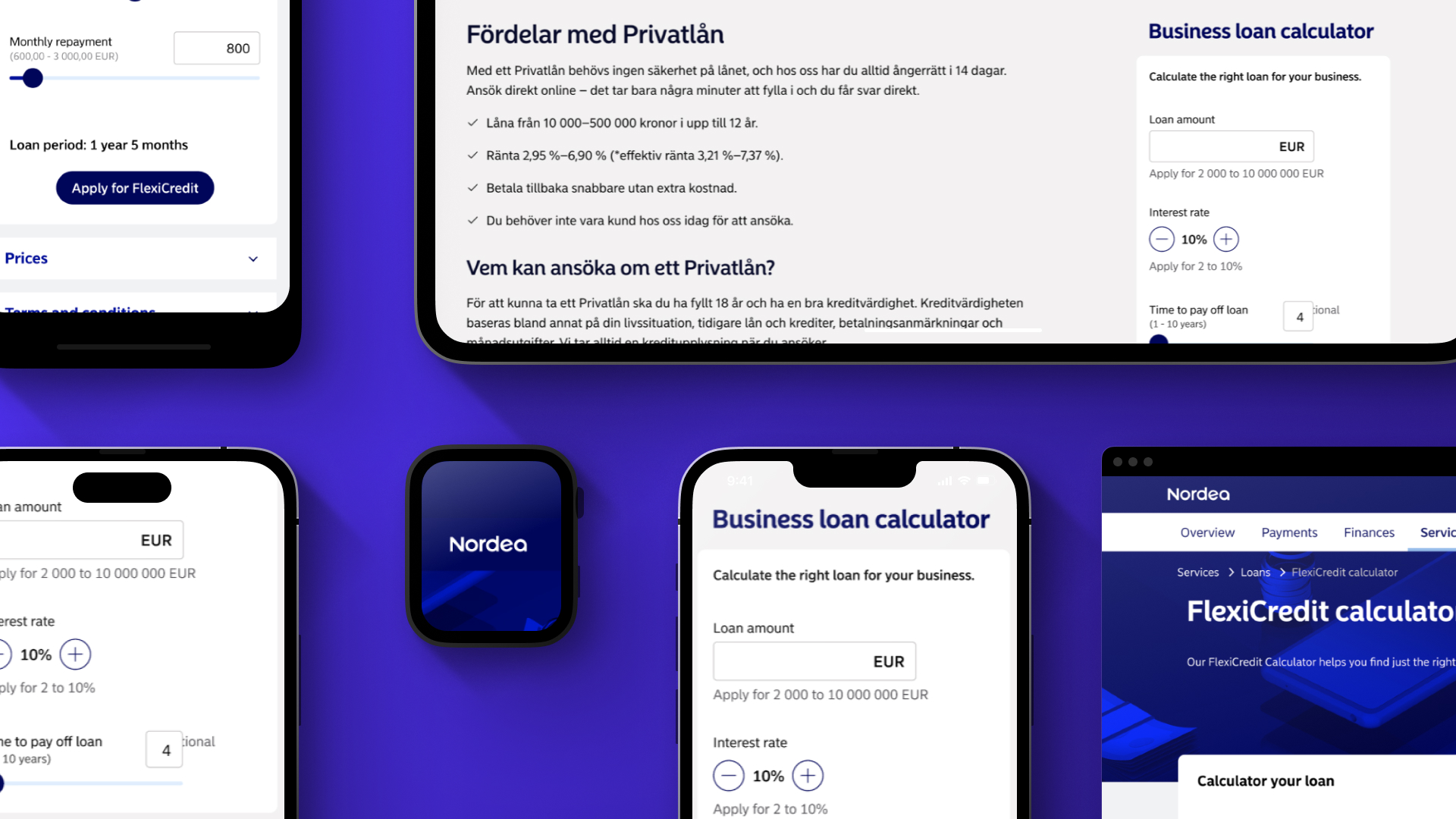
Nordea - Loan calculator
Overview
I led this project to redesign a B2B loan calculator, which evolved into a strategic initiative to redefine how calculators are integrated across Nordea's logged-in areas.
These tools are critical for sales, yet they suffered from a massive backlog and decades-old designs.
My role was to modernize them and establish a user-centric framework for future development.
My role
Lead UX Designer, responsible for usability assessment, ideation, wireframing, UX writing support, UI design, prototyping, user testing, interviewing, and stakeholder management.
Context
Who is who?
To better follow this project, we must understand the two environments separating Nordea services:
- The open Pages: Public-facing, no login required.
- Product Store (Logged-in Area): Where existing customers manage accounts and explore new products.
Open pages (No login)
Project phase 1
Public-facing
Design and implementation inconsistencies.
VS
Product Store (Login needed)
Project phase 2
Customers only
Latest designs and implementation for most pages and services.
Old calculator, old problems.
The project began as a simple UI update for a legacy B2B calculator on the Open Pages. The tool was non-responsive, inaccessible, and plagued by usability issues.I inherited this project late, with a pre-agreed scope: a visual facelift only, no user testing, and a tight deadline, constraining my initial efforts to working within the limits of an old CMS.
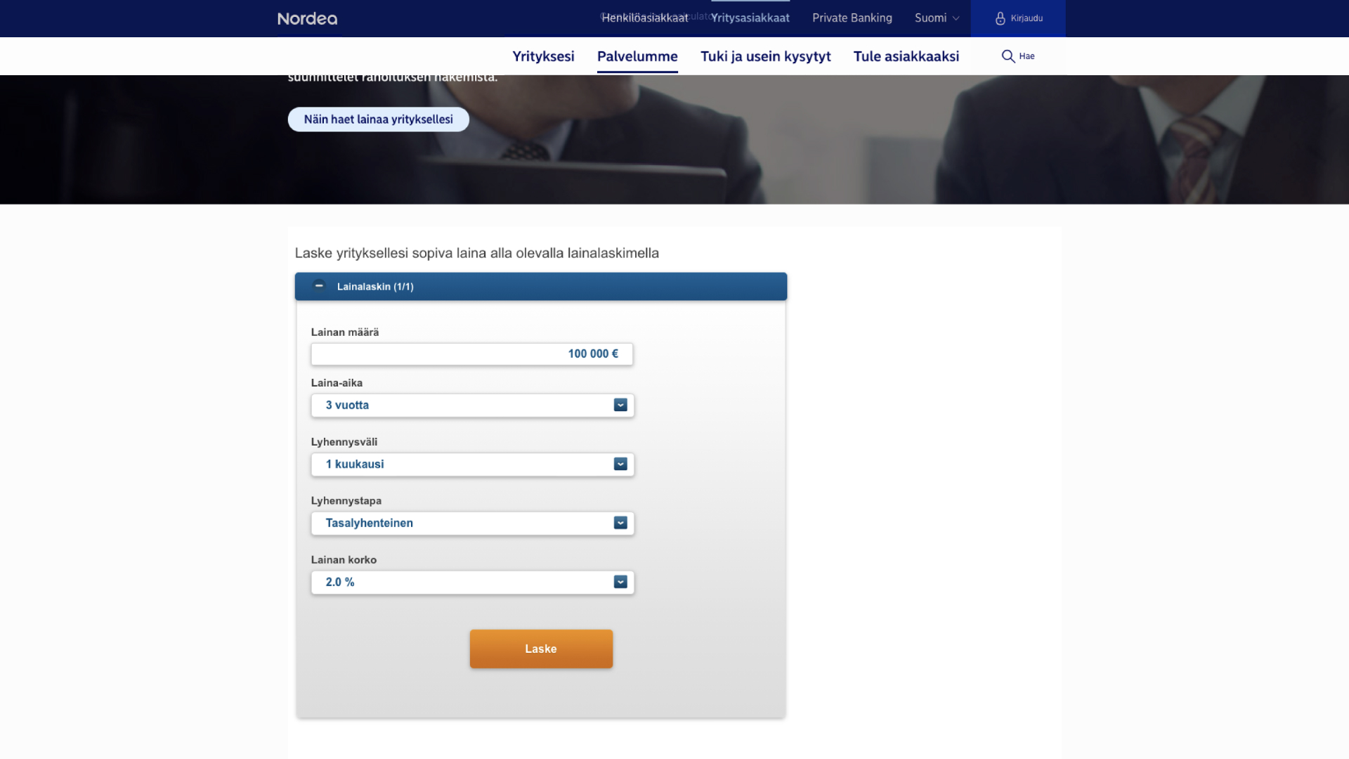
Issues with old calculator:
- Legacy application.
- Not responsive.
- Not accessible at all.
- Inconsistent with Design System.
- Wrong content placement pattern.
Phase 1
The Surface-Level Redesign
Despite the constraints, I conducted benchmarking and desk research on form design best practices. I delivered a revamped, more flexible UI with improved UX writing to eliminate jargon and increase efficiency.However, without validation, I knew the design was untested and potentially flawed for broader application.
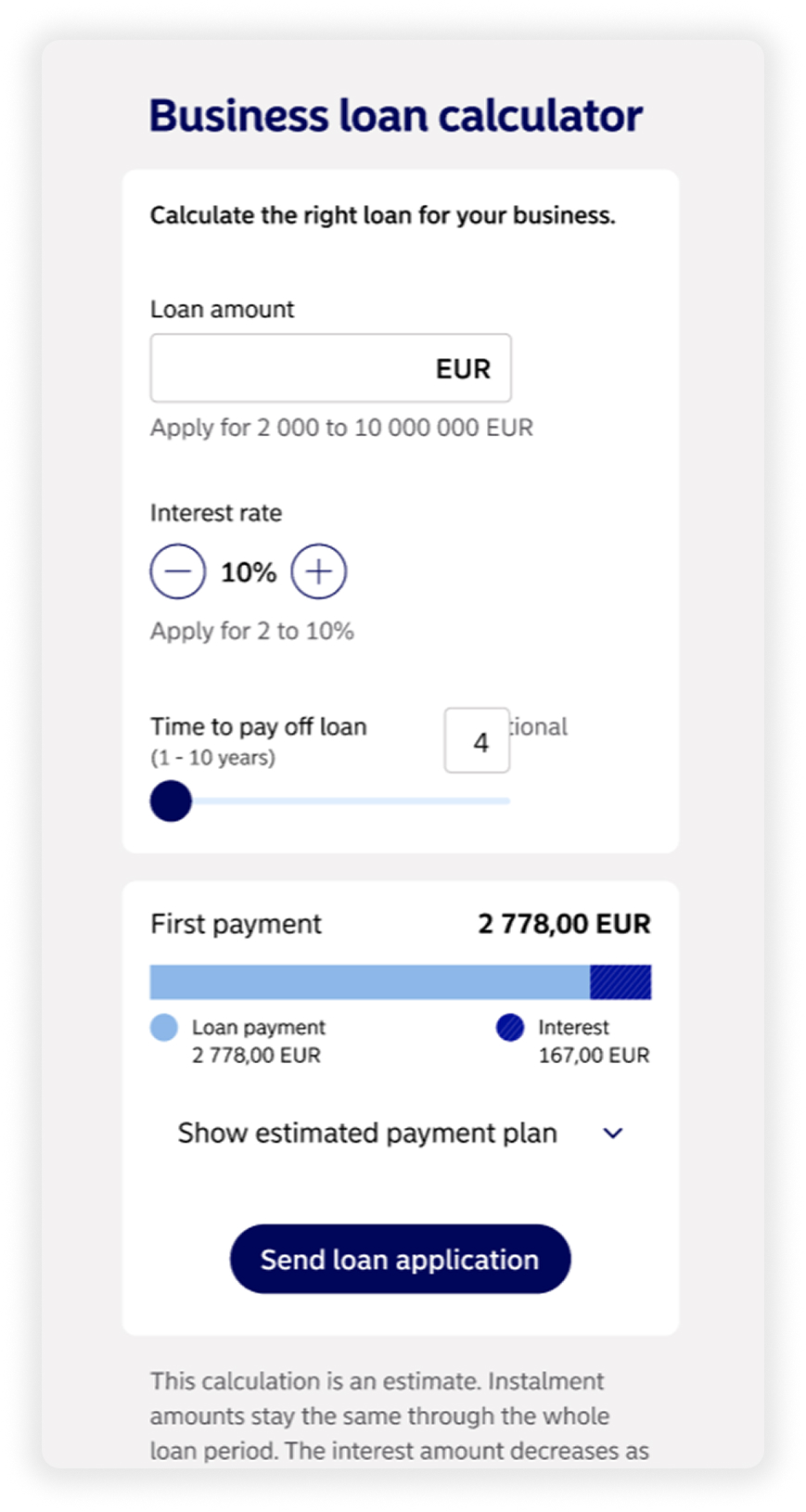
Results so far
👍 A much better design:
- Responsive.
- Compliant with a set of standards and best practices.
👎 No real users involved in the process.
Phase 2
Round 2, fight!
Months later, I was asked to adapt the same design for the Product Store. My "problem radar" went off as this was a completely different context with different tech stacks and user needs.
I reframed the overall goal using the How Might We approach:
“How might we integrate calculators in the Product Store most efficiently for both customers and the business?”
Old assumptions vs the reality (and research!)
Previous concepts for the logged-in area used dedicated calculator pages, but new research revealed a better path: customers wanted all key information, including pricing and terms, on a single page.I discarded old work and began exploring integrations that placed the calculator directly alongside product details.
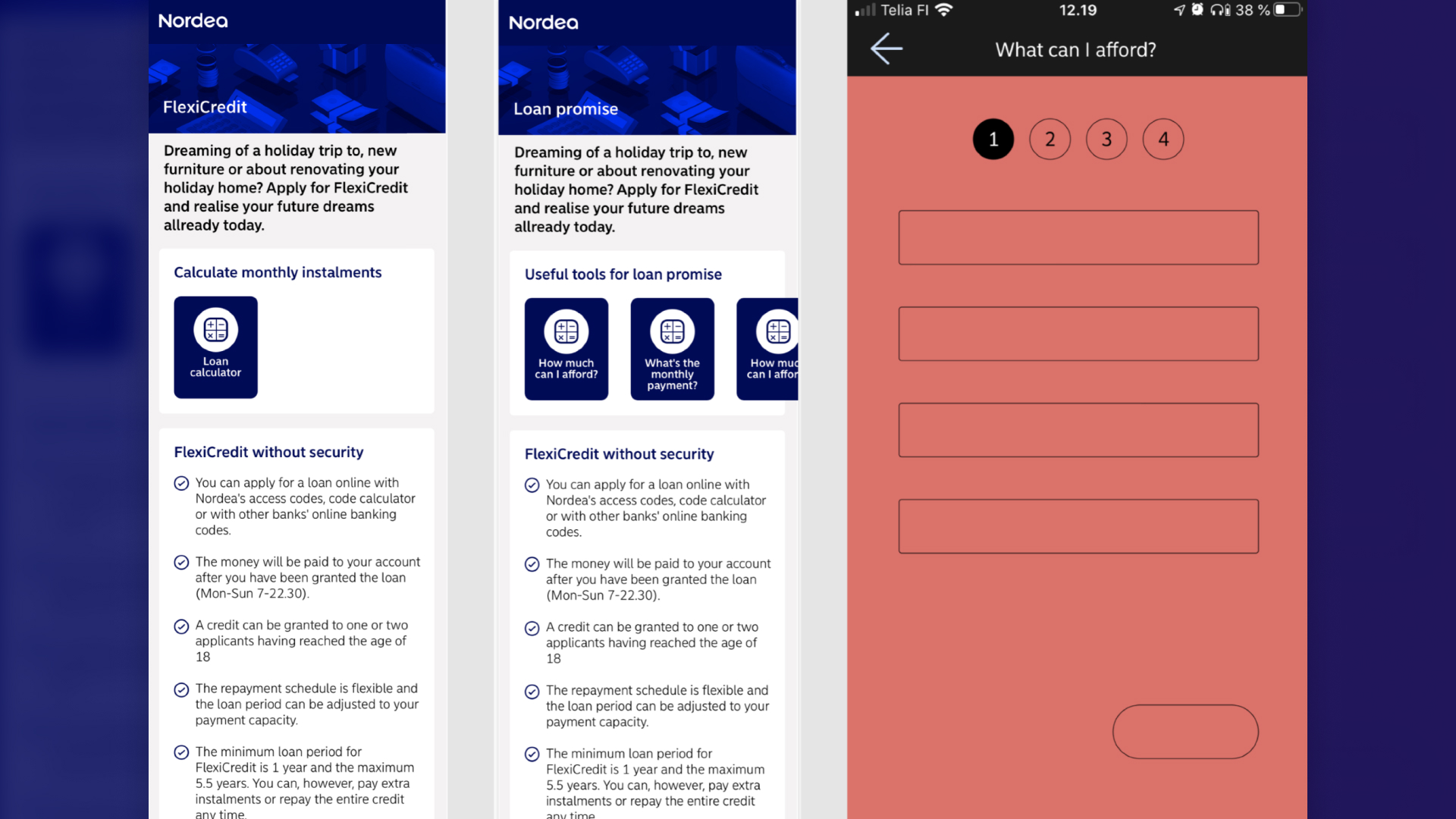
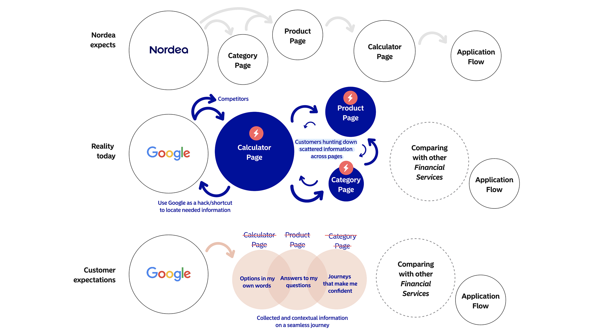
This picture summarizes one of the key insights from user research, showing the loan application user journey.
Calculator + product info = win!
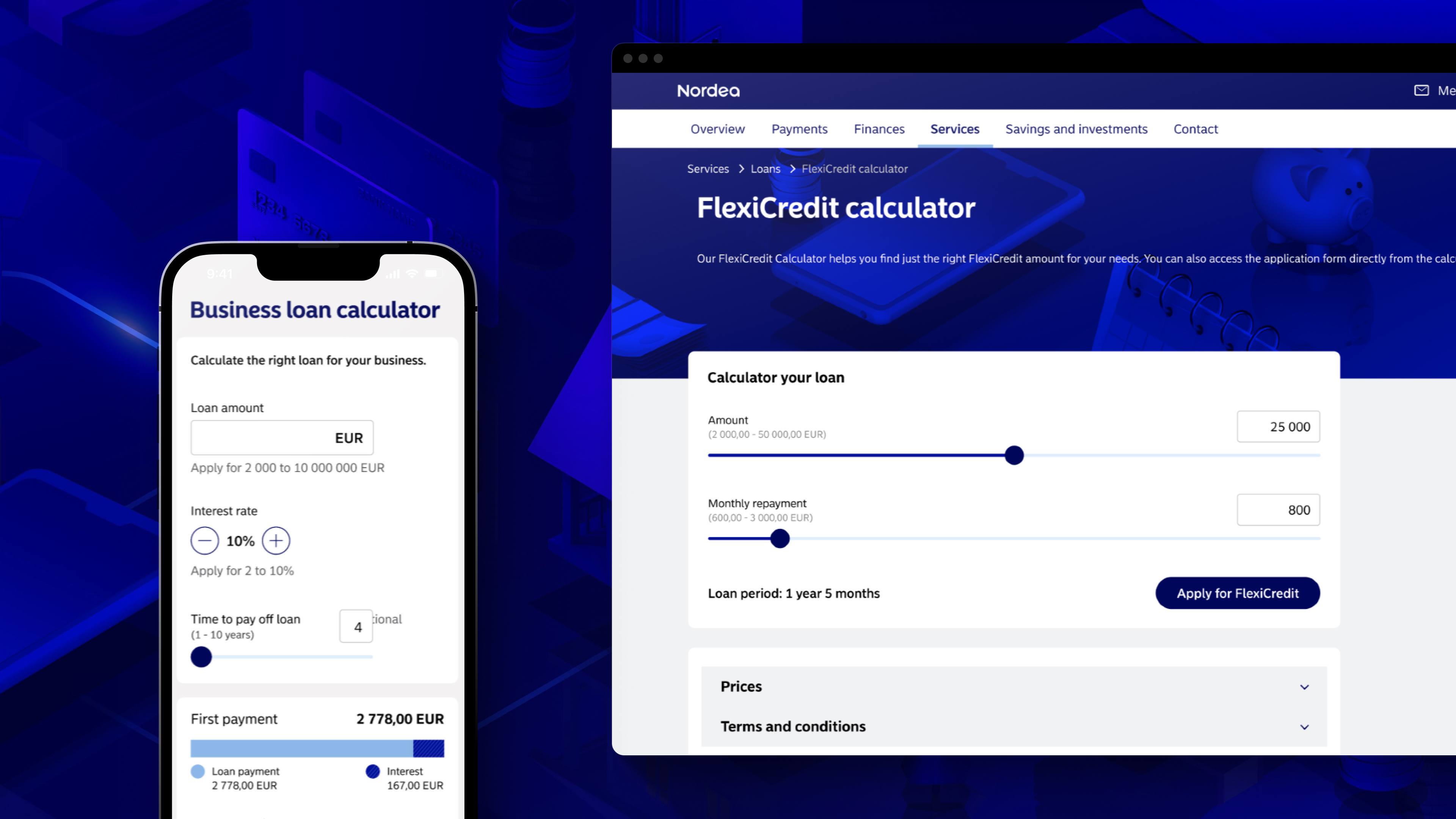
Customers wanted to avoid navigating to different pages to find everything they needed. Prices and terms and conditions are often the top priorities when looking for a new financial product. So ideally, calculators would be close to this kind of information.That said, I started experimenting with a couple of different ideas, as show below.If you take a closer look, you will see a “Flexi credit” calculator in this scenario instead of the business loan one I used before.Besides exploring other scenarios, that happened because I considered conducting usability tests and interviews with our B2C audience instead of B2B to make it easier to recruit the right users, as business customers were harder to reach due to Nordea's internal policies.
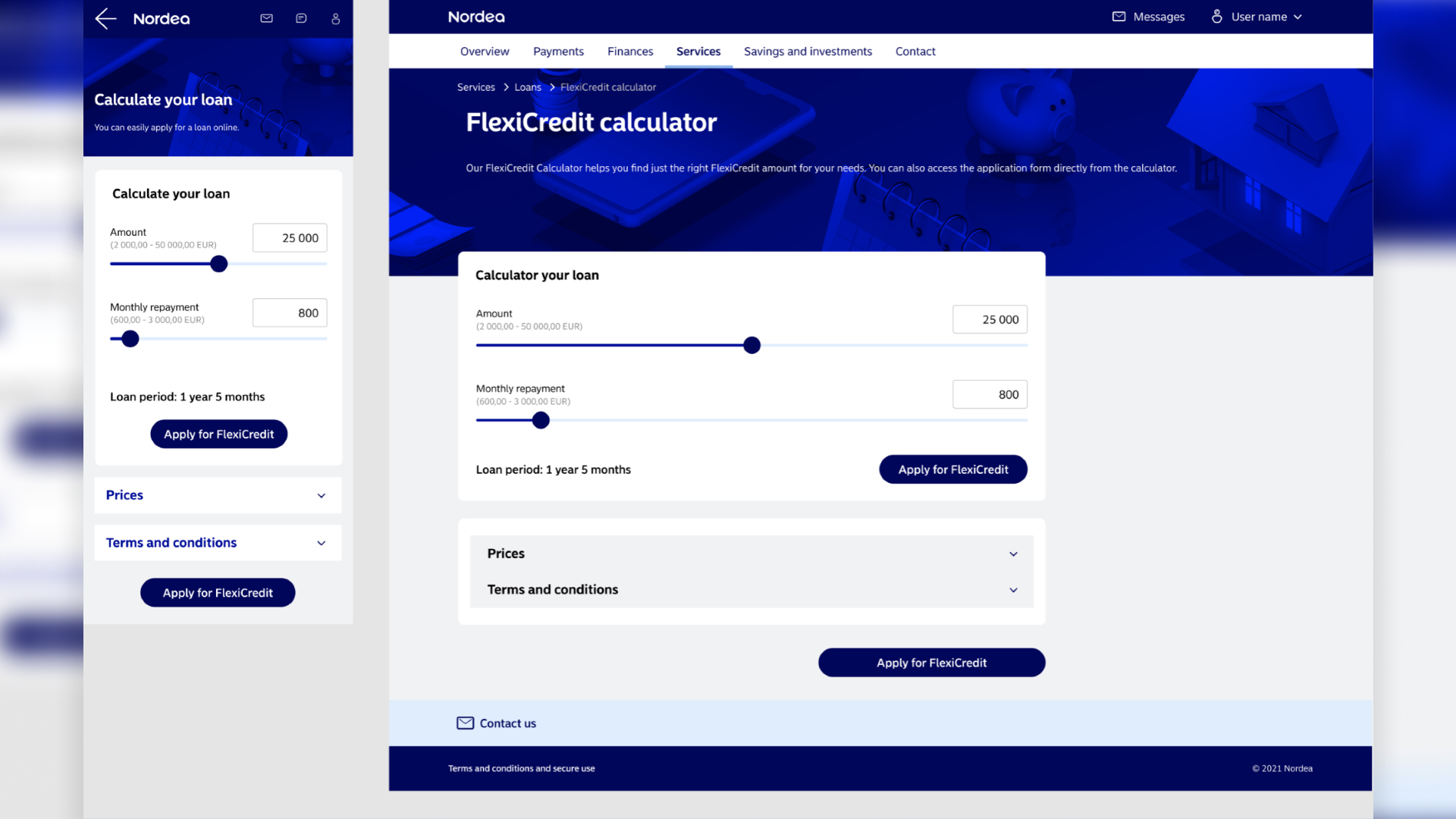
Results - desktop
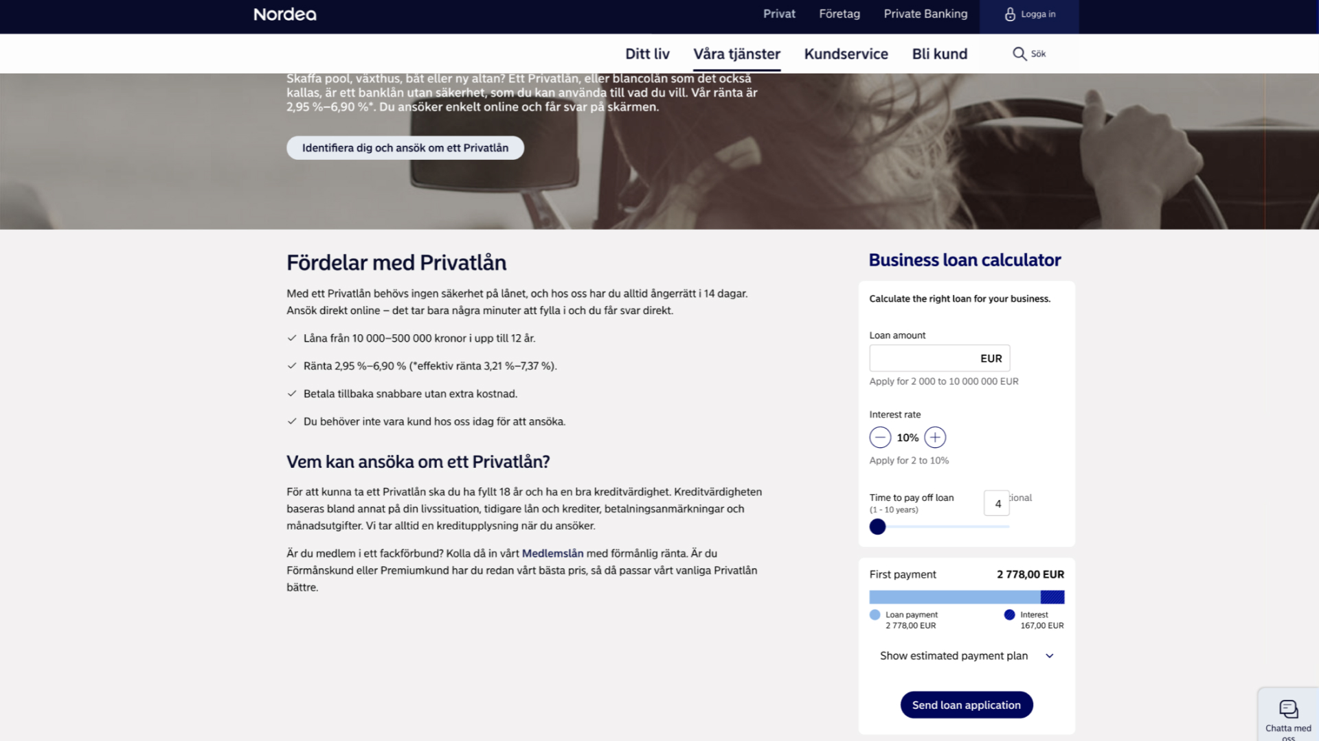
The result used a very similar approach than the existing Product Store layout, just moving some text to the central column and clearing the side column at the left to create a dedicated calculator space.
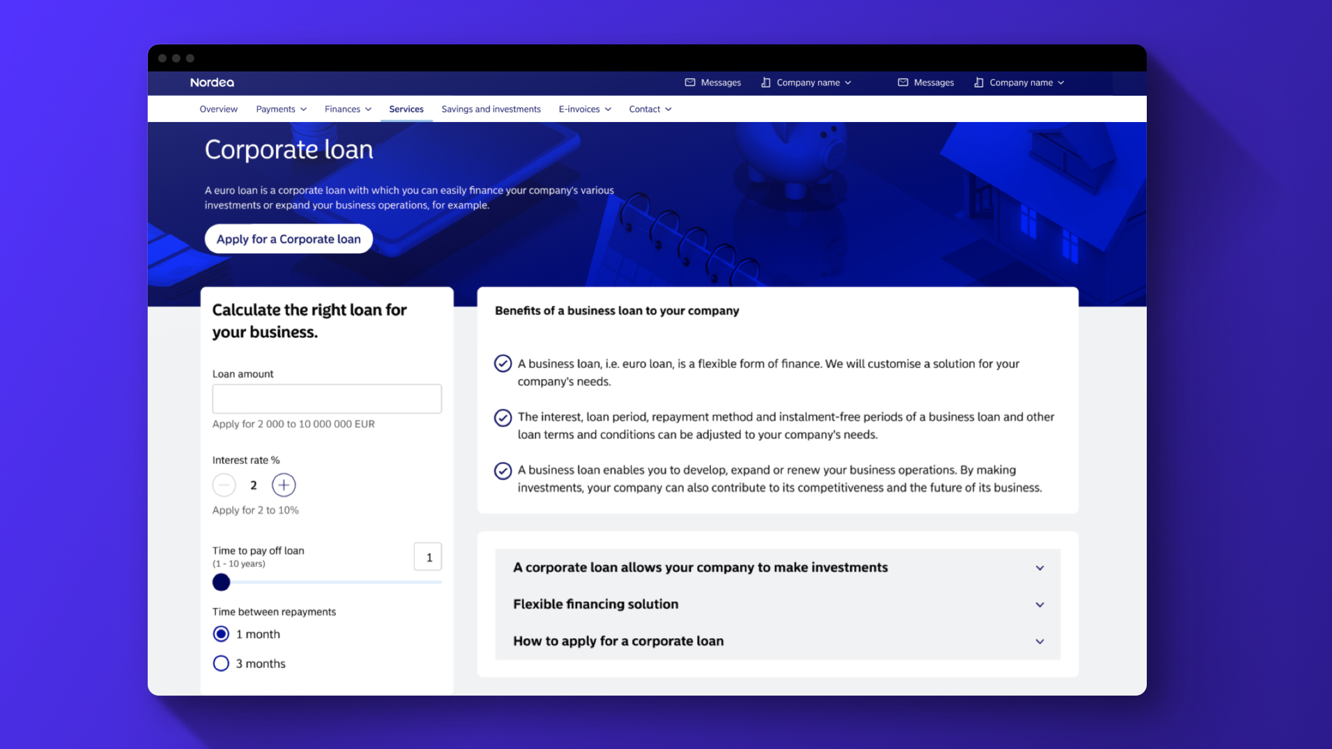
Results - mobile
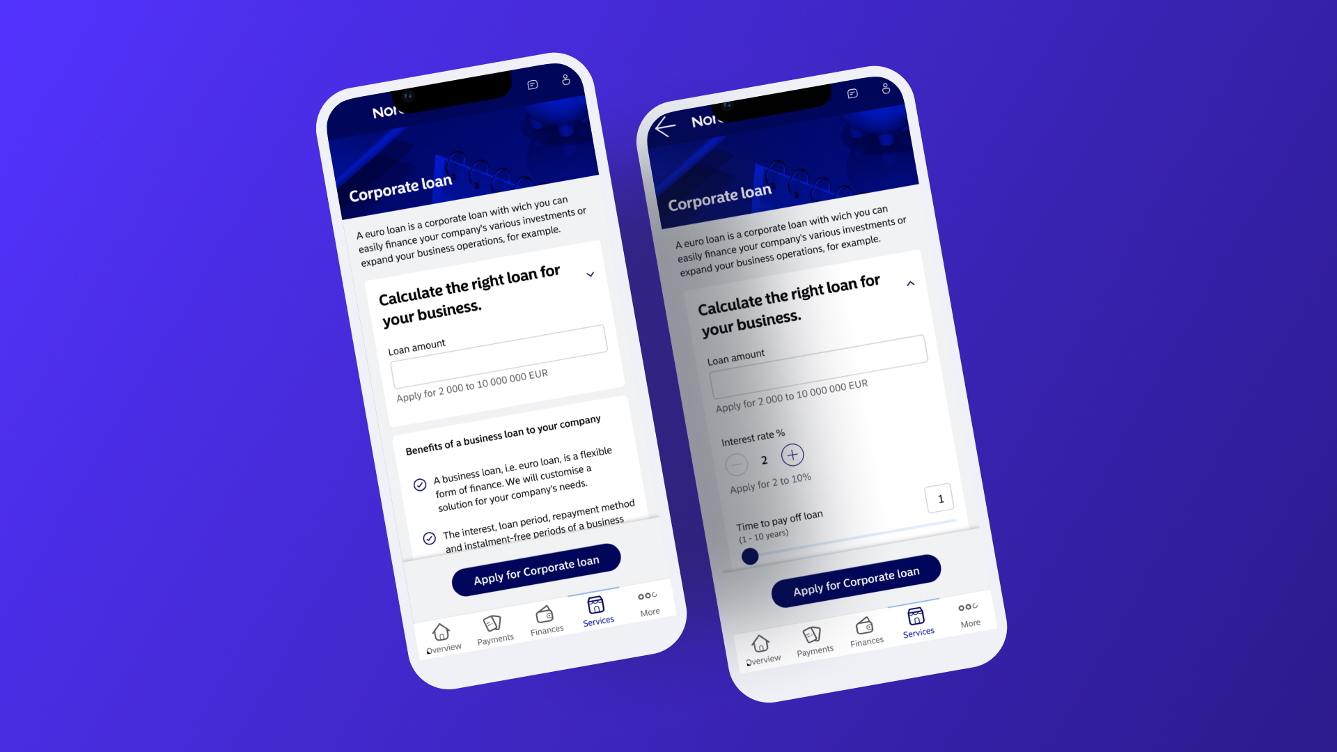
The mobile required specific adaptations, showing only a bit of the calculator at the default state. This was done to avoid hiding all the product information from the page in the first fold.
After interacting with the calculator, it expands and shows the rest of the content.
Old ghosts hunting us
This whole story was told to show how the issues in the first phase affected the result in the second one.The addition of an embedded CTA inside the new calculator.I decided to include it as a fixed part of the layout after I learned there were plenty of calculators with no clear next step for the users. And, of course, that affected how they progressed through the sales funnel.These calculators didn't have a button because the Open Pages content managers were adding it separated from the rest of the layout, and using huge pieces of text between them, making the CTA be at the bottom of the page, often many folds below, while the calculators were usually on top.
Validation - user testing
This time, I secured buy-in for user testing, using different methods. The goal was to clarify doubts about where I placed the calculator and the interaction patterns used on mobile.The results were very positive.
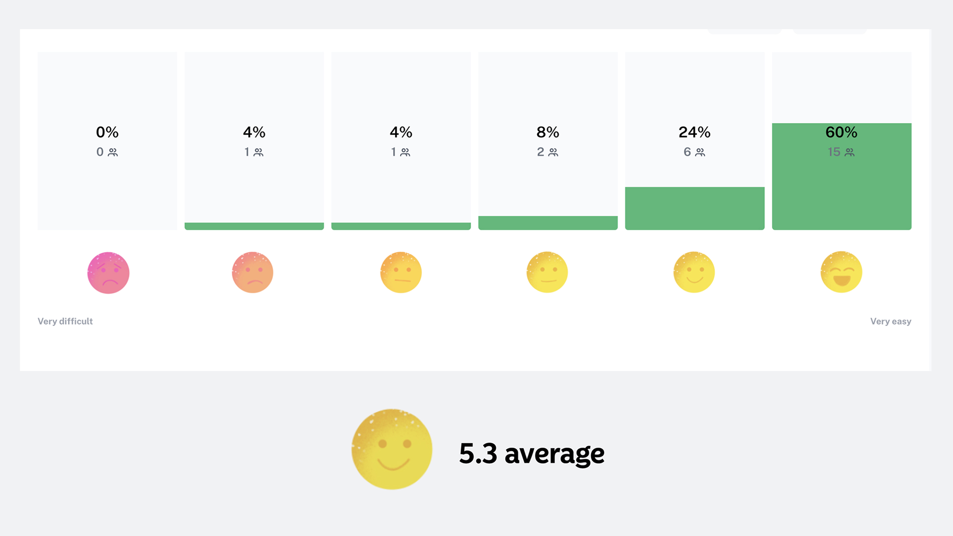
How difficult or easy it was to find the first payment amount?
1-very difficult / 6-very easy
👍 Unmoderated usability test:
- 60+ answers from real users
- 5.3 out of 6 user rate for “easy to use”
Validation - survey
I've got no comments about the calculator being collapsed by default on mobile, which is good, as I read it as no one was disturbed by this behavior.Other insights and interesting comments mentioned the CTAs, two in the tested concept, since I used the same design from open pages with the embedded one I mentioned before.There were also comments about how good it is to have less text on the Product Store page, at least that's how they felt after I moved the text from the left to the top. And users also highlighted how the calculator placement feels natural.
Confusing CTAs:
“Does the "Apply for corporate loan" button take you to same place in both cases?”
More icons:
“It would be worth to explore using icons and illustrations”
Less is more:
“Less text on the page is very welcome.”
Easy to find:
“Yes that is a natural place to search for but would definitly like it to be also visible when applying for the loan.”
Easy to find:
“It is placed where it should.”
Feedback iteration
In the end, I managed to clarify my existing doubts.
When applying this design to the logged area, I removed the CTA in the calculator, leaving only the other button we had on the Product Store pages.I updated the title to avoid confusing words, following customer feedback, and confirmed that the current approach for mobile wouldn’t be an obstacle.One of my main worries was whether we would need a CTA to activate and expand the mobile calculator before using it, but I also learned it was unnecessary.
👍 Iteration:
- Removed extra CTA on Desktop.
- Updated tittle following user feedback.
- Confirmed that users would easily learn and understand how to use the mobile version.
Aftermath & Future Opportunities
A project that began with significant constraints concluded successfully.More importantly, it generated a strategic research plan to guide future calculator development, based on emerging user questions like, “Why do customers perceive calculators as application forms?”
Thanks for reading.
Nordea - Loan calculator
Overview
I led this project to redesign a B2B loan calculator, which evolved into a strategic initiative to redefine how calculators are integrated across Nordea's logged-in areas.
These tools are critical for sales, yet they suffered from a massive backlog and decades-old designs.
My role was to modernize them and establish a user-centric framework for future development.
My role
Lead UX Designer, responsible for usability assessment, ideation, wireframing, UX writing support, UI design, prototyping, user testing, interviewing, and stakeholder management.
Context
Who is who?
To better follow this project, we must understand the two environments separating Nordea services:
- The open Pages: Public-facing, no login required.
- Product Store (Logged-in Area): Where existing customers manage accounts and explore new products.
Open pages (No login)
Project phase 1
Public-facing
Design and implementation inconsistencies.
VS
Product Store (Login needed)
Project phase 2
Customers only
Latest designs and implementation for most pages and services.
Old calculator, old problems.
The project began as a simple UI update for a legacy B2B calculator on the Open Pages. The tool was non-responsive, inaccessible, and plagued by usability issues.I inherited this project late, with a pre-agreed scope: a visual facelift only, no user testing, and a tight deadline, constraining my initial efforts to working within the limits of an old CMS.
Issues with old calculator:
- Legacy application.
- Not responsive.
- Not accessible at all.
- Inconsistent with Design System.
- Wrong content placement pattern.
Phase 1
The Surface-Level Redesign
Despite the constraints, I conducted benchmarking and desk research on form design best practices. I delivered a revamped, more flexible UI with improved UX writing to eliminate jargon and increase efficiency.However, without validation, I knew the design was untested and potentially flawed for broader application.
Results so far
👍 A much better design:
- Responsive.
- Compliant with a set of standards and best practices.
👎 No real users involved in the process.
Phase 2
Round 2, fight!
Months later, I was asked to adapt the same design for the Product Store. My "problem radar" went off as this was a completely different context with different tech stacks and user needs.
I reframed the overall goal using the How Might We approach:
“How might we integrate calculators in the Product Store most efficiently for both customers and the business?”
Old assumptions vs the reality (and research!)
Previous concepts for the logged-in area used dedicated calculator pages, but new research revealed a better path: customers wanted all key information, including pricing and terms, on a single page.I discarded old work and began exploring integrations that placed the calculator directly alongside product details.
This picture summarizes one of the key insights from user research, showing the loan application user journey.
Calculator + product info = win!
Customers wanted to avoid navigating to different pages to find everything they needed. Prices and terms and conditions are often the top priorities when looking for a new financial product. So ideally, calculators would be close to this kind of information.That said, I started experimenting with a couple of different ideas, as show below.If you take a closer look, you will see a “Flexi credit” calculator in this scenario instead of the business loan one I used before.Besides exploring other scenarios, that happened because I considered conducting usability tests and interviews with our B2C audience instead of B2B to make it easier to recruit the right users, as business customers were harder to reach due to Nordea's internal policies.
Results - desktop
The result used a very similar approach than the existing Product Store layout, just moving some text to the central column and clearing the side column at the left to create a dedicated calculator space.
Results - mobile
The mobile required specific adaptations, showing only a bit of the calculator at the default state. This was done to avoid hiding all the product information from the page in the first fold.
After interacting with the calculator, it expands and shows the rest of the content.
Old ghosts hunting us
This whole story was told to show how the issues in the first phase affected the result in the second one.The addition of an embedded CTA inside the new calculator.I decided to include it as a fixed part of the layout after I learned there were plenty of calculators with no clear next step for the users. And, of course, that affected how they progressed through the sales funnel.These calculators didn't have a button because the Open Pages content managers were adding it separated from the rest of the layout, and using huge pieces of text between them, making the CTA be at the bottom of the page, often many folds below, while the calculators were usually on top.
Validation - user testing
This time, I secured buy-in for user testing, using different methods. The goal was to clarify doubts about where I placed the calculator and the interaction patterns used on mobile.The results were very positive.
How difficult or easy it was to find the first payment amount?
1-very difficult / 6-very easy
👍 Unmoderated usability test:
- 60+ answers from real users
- 5.3 out of 6 user rate for “easy to use”
Validation - survey
I've got no comments about the calculator being collapsed by default on mobile, which is good, as I read it as no one was disturbed by this behavior.Other insights and interesting comments mentioned the CTAs, two in the tested concept, since I used the same design from open pages with the embedded one I mentioned before.There were also comments about how good it is to have less text on the Product Store page, at least that's how they felt after I moved the text from the left to the top. And users also highlighted how the calculator placement feels natural.
Confusing CTAs:
“Does the "Apply for corporate loan" button take you to same place in both cases?”
More icons:
“It would be worth to explore using icons and illustrations”
Less is more:
“Less text on the page is very welcome.”
Easy to find:
“Yes that is a natural place to search for but would definitly like it to be also visible when applying for the loan.”
Easy to find:
“It is placed where it should.”
Feedback iteration
In the end, I managed to clarify my existing doubts.
When applying this design to the logged area, I removed the CTA in the calculator, leaving only the other button we had on the Product Store pages.I updated the title to avoid confusing words, following customer feedback, and confirmed that the current approach for mobile wouldn’t be an obstacle.One of my main worries was whether we would need a CTA to activate and expand the mobile calculator before using it, but I also learned it was unnecessary.
👍 Iteration:
- Removed extra CTA on Desktop.
- Updated tittle following user feedback.
- Confirmed that users would easily learn and understand how to use the mobile version.
Aftermath & Future Opportunities
A project that began with significant constraints concluded successfully.More importantly, it generated a strategic research plan to guide future calculator development, based on emerging user questions like, “Why do customers perceive calculators as application forms?”
Thanks for reading.
Nordea - Loan calculator
Overview
I led this project to redesign a B2B loan calculator, which evolved into a strategic initiative to redefine how calculators are integrated across Nordea's logged-in areas.
These tools are critical for sales, yet they suffered from a massive backlog and decades-old designs.
My role was to modernize them and establish a user-centric framework for future development.
My role
Lead UX Designer, responsible for usability assessment, ideation, wireframing, UX writing support, UI design, prototyping, user testing, interviewing, and stakeholder management.
Context
Who is who?
To better follow this project, we must understand the two environments separating Nordea services:
- The open Pages: Public-facing, no login required.
- Product Store (Logged-in Area): Where existing customers manage accounts and explore new products.
Open pages (No login)
Project phase 1
Public-facing
Design and implementation inconsistencies.
VS
Product Store (Login needed)
Project phase 2
Customers only
Latest designs and implementation for most pages and services.
Old calculator, old problems.
The project began as a simple UI update for a legacy B2B calculator on the Open Pages. The tool was non-responsive, inaccessible, and plagued by usability issues.I inherited this project late, with a pre-agreed scope: a visual facelift only, no user testing, and a tight deadline, constraining my initial efforts to working within the limits of an old CMS.
Issues with old calculator:
- Legacy application.
- Not responsive.
- Not accessible at all.
- Inconsistent with Design System.
- Wrong content placement pattern.
Phase 1
The Surface-Level Redesign
Despite the constraints, I conducted benchmarking and desk research on form design best practices. I delivered a revamped, more flexible UI with improved UX writing to eliminate jargon and increase efficiency.However, without validation, I knew the design was untested and potentially flawed for broader application.
Results so far
👍 A much better design:
- Responsive.
- Compliant with a set of standards and best practices.
👎 No real users involved in the process.
Phase 2
Round 2, fight!
Months later, I was asked to adapt the same design for the Product Store. My "problem radar" went off as this was a completely different context with different tech stacks and user needs.
I reframed the overall goal using the How Might We approach:
“How might we integrate calculators in the Product Store most efficiently for both customers and the business?”
Old assumptions vs the reality (and research!)
Previous concepts for the logged-in area used dedicated calculator pages, but new research revealed a better path: customers wanted all key information, including pricing and terms, on a single page.I discarded old work and began exploring integrations that placed the calculator directly alongside product details.
This picture summarizes one of the key insights from user research, showing the loan application user journey.
Calculator + product info = win!
Customers wanted to avoid navigating to different pages to find everything they needed. Prices and terms and conditions are often the top priorities when looking for a new financial product. So ideally, calculators would be close to this kind of information.That said, I started experimenting with a couple of different ideas, as show below.If you take a closer look, you will see a “Flexi credit” calculator in this scenario instead of the business loan one I used before.Besides exploring other scenarios, that happened because I considered conducting usability tests and interviews with our B2C audience instead of B2B to make it easier to recruit the right users, as business customers were harder to reach due to Nordea's internal policies.
Results - desktop
The result used a very similar approach than the existing Product Store layout, just moving some text to the central column and clearing the side column at the left to create a dedicated calculator space.
Results - mobile
The mobile required specific adaptations, showing only a bit of the calculator at the default state. This was done to avoid hiding all the product information from the page in the first fold.
After interacting with the calculator, it expands and shows the rest of the content.
Old ghosts hunting us
This whole story was told to show how the issues in the first phase affected the result in the second one. The addition of an embedded CTA inside the new calculator, for instance.I decided to include it as a fixed part of the layout after I learned there were plenty of calculators with no clear next step for the users. And, of course, that affected how they progressed through the sales funnel.These calculators didn't have a button because the Open Pages content managers were adding it separated from the rest of the layout, and using huge pieces of text between them, making the CTA be at the bottom of the page, often many folds below, while the calculators were usually on top.
Validation - user testing
This time, I secured buy-in for user testing, using different methods. The goal was to clarify doubts about where I placed the calculator and the interaction patterns used on mobile.The results were very positive.
How difficult or easy it was to find the first payment amount?
1-very difficult / 6-very easy
👍 Unmoderated usability test:
- 60+ answers from real users
- 5.3 out of 6 user rate for “easy to use”
Validation - survey
I've got no comments about the calculator being collapsed by default on mobile, which is good, as I read it as no one was disturbed by this behavior.Other insights and interesting comments mentioned the CTAs, two in the tested concept, since I used the same design from open pages with the embedded one I mentioned before.There were also comments about how good it is to have less text on the Product Store page, at least that's how they felt after I moved the text from the left to the top. And users also highlighted how the calculator placement feels natural.
Confusing CTAs:
“Does the "Apply for corporate loan" button take you to same place in both cases?”
More icons:
“It would be worth to explore using icons and illustrations”
Less is more:
“Less text on the page is very welcome.”
Easy to find:
“Yes that is a natural place to search for but would definitly like it to be also visible when applying for the loan.”
Easy to find:
“It is placed where it should.”
Feedback iteration
In the end, I managed to clarify my existing doubts.
When applying this design to the logged area, I removed the CTA in the calculator, leaving only the other button we had on the Product Store pages.I updated the title to avoid confusing words, following customer feedback, and confirmed that the current approach for mobile wouldn’t be an obstacle.One of my main worries was whether we would need a CTA to activate and expand the mobile calculator before using it, but I also learned it was unnecessary.
👍 Iteration:
- Removed extra CTA on Desktop.
- Updated tittle following user feedback.
- Confirmed that users would easily learn and understand how to use the mobile version.
Aftermath & Future Opportunities
A project that began with significant constraints concluded successfully.More importantly, it generated a strategic research plan to guide future calculator development, based on emerging user questions like, “Why do customers perceive calculators as application forms?”
Thanks for reading.